Interpret machine learning models using model-agnostic methods
Calculate and visualize variable importance
Create partial dependence and ICE plots
Explain individual predictions with SHAP values
Analyze time series data with temporal autocorrelation
Decompose time series into trend, seasonal, and noise components
Build ARIMA models for forecasting
Account for temporal autocorrelation in regression models
9.1 Introduction
This chapter explores advanced modeling techniques that extend beyond traditional regression. We’ll cover model interpretation methods that help us understand “black box” machine learning models, and time series analysis for data collected sequentially over time.
9.2 Model Interpretation and Explainability
While machine learning models like Random Forest can achieve high predictive accuracy, understanding why they make specific predictions is crucial for ecological applications. Model interpretation helps us extract ecological insights and communicate results to stakeholders.
9.2.1 Variable Importance
Code
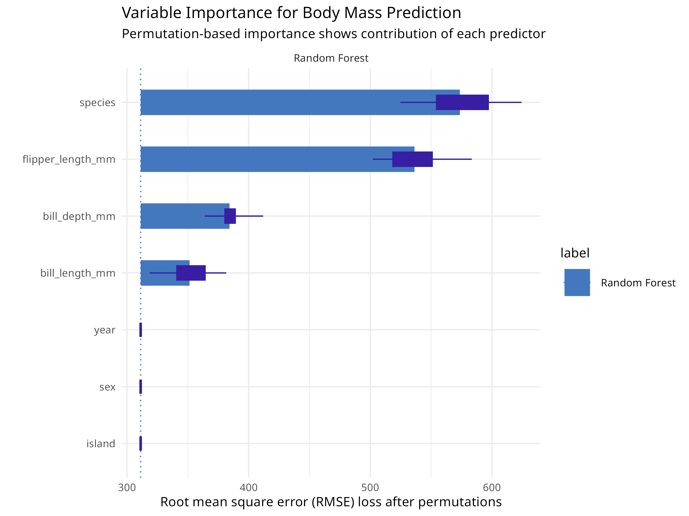
# Load packages for model interpretationlibrary(DALEX)library(DALEXtra)library(tidymodels)library(palmerpenguins)# Prepare the penguins data (same as chapter 08)penguins<-palmerpenguins::penguins%>%drop_na()# Split data into training and testing setsset.seed(123)penguin_split<-initial_split(penguins, prop =0.75, strata =species)penguin_train<-training(penguin_split)penguin_test<-testing(penguin_split)# Define a recipe for preprocessingpenguin_recipe<-recipe(body_mass_g~bill_length_mm+bill_depth_mm+flipper_length_mm+species, data =penguin_train)%>%step_dummy(species)%>%step_normalize(all_numeric_predictors())%>%step_zv(all_predictors())# Define Random Forest model specificationrf_spec<-rand_forest(trees =100)%>%set_engine("ranger")%>%set_mode("regression")# Create workflowrf_wf<-workflow()%>%add_recipe(penguin_recipe)%>%add_model(rf_spec)# Fit the final modelfinal_fit<-rf_wf%>%fit(data =penguin_train)# Create an explainer objectexplainer_rf<-explain_tidymodels(final_fit, data =penguin_test%>%select(-body_mass_g), y =penguin_test$body_mass_g, label ="Random Forest", verbose =FALSE)# Calculate variable importance using permutationvi_rf<-model_parts(explainer_rf, loss_function =loss_root_mean_square)# Visualize variable importanceplot(vi_rf)+labs(title ="Variable Importance for Body Mass Prediction", subtitle ="Permutation-based importance shows contribution of each predictor")+theme_minimal()# Get the importance valuesvi_df<-as.data.frame(vi_rf)vi_summary<-vi_df%>%filter(variable!="_baseline_", variable!="_full_model_")%>%group_by(variable)%>%summarize( mean_dropout_loss =mean(dropout_loss), .groups ="drop")%>%arrange(desc(mean_dropout_loss))print(vi_summary)#> # A tibble: 7 × 2#> variable mean_dropout_loss#> <chr> <dbl>#> 1 species 574.#> 2 flipper_length_mm 536.#> 3 bill_depth_mm 384.#> 4 bill_length_mm 351.#> 5 island 311.#> 6 sex 311.#> 7 year 311.
Figure 9.1: Variable importance for body mass prediction
Code Explanation
This code demonstrates model-agnostic variable importance:
DALEX Framework
Creates an “explainer” object that wraps the tidymodels workflow
Provides a unified interface for model interpretation
Works with any model type (linear, tree-based, neural networks)
Permutation Importance
Measures how much model performance decreases when a variable is randomly shuffled
Higher dropout loss = more important variable
Unlike tree-based importance, this works for any model and accounts for correlations
Interpretation
Variables are ranked by their contribution to predictions
Helps identify which morphological features are most predictive of body mass
Provides ecological insights into species morphology
9.2.2 Partial Dependence Plots
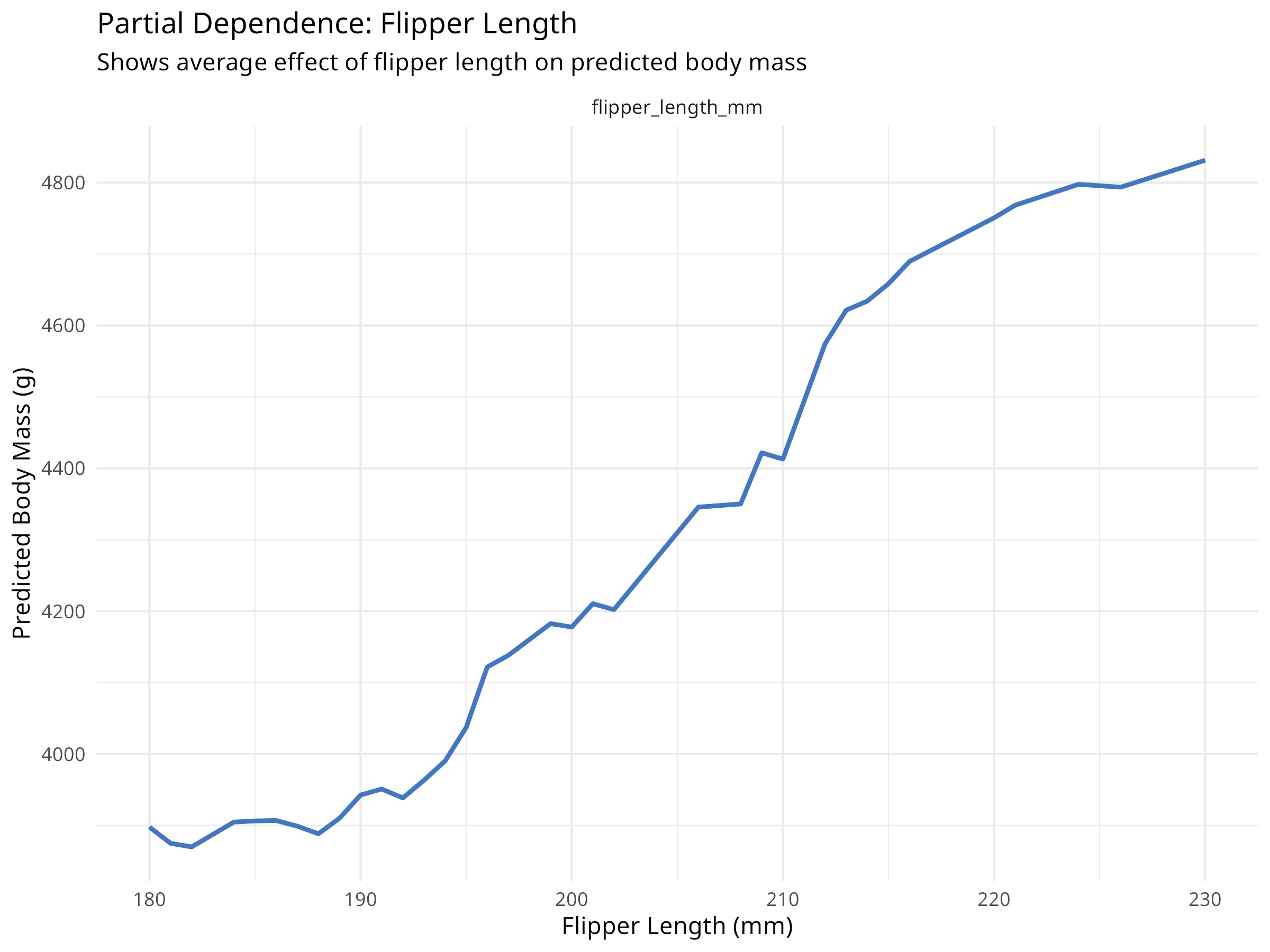
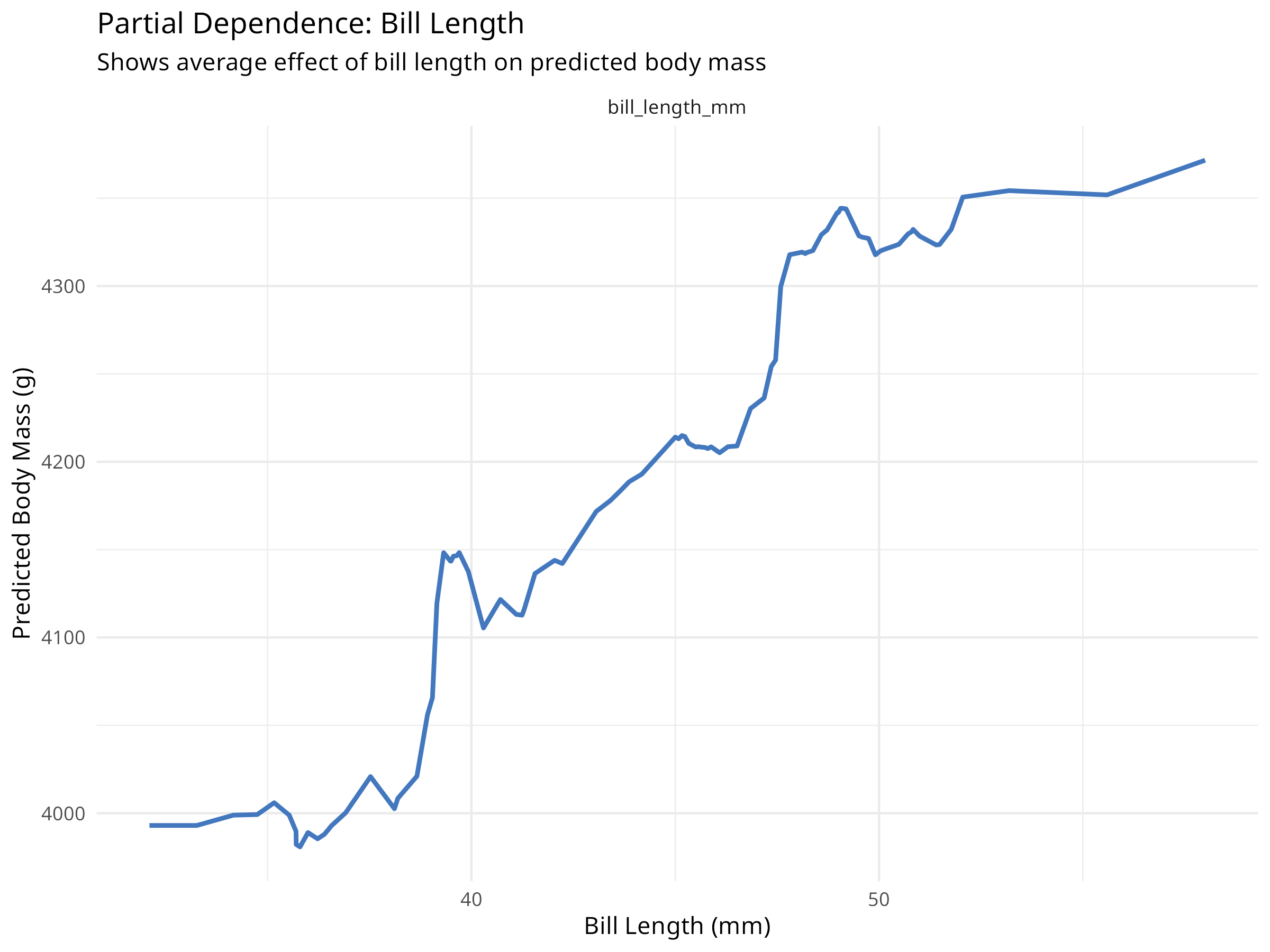
Partial dependence plots show how predictions change as a single variable varies, while averaging over all other variables.
Code
# Create partial dependence profiles for key variablespdp_flipper<-model_profile(explainer_rf, variables ="flipper_length_mm", N =NULL# Use all observations)pdp_bill<-model_profile(explainer_rf, variables ="bill_length_mm", N =NULL)# Plot partial dependenceplot(pdp_flipper)+labs(title ="Partial Dependence: Flipper Length", subtitle ="Shows average effect of flipper length on predicted body mass", x ="Flipper Length (mm)", y ="Predicted Body Mass (g)")+theme_minimal()plot(pdp_bill)+labs(title ="Partial Dependence: Bill Length", subtitle ="Shows average effect of bill length on predicted body mass", x ="Bill Length (mm)", y ="Predicted Body Mass (g)")+theme_minimal()# Create 2D partial dependence plot for interactionspdp_2d<-model_profile(explainer_rf, variables =c("flipper_length_mm", "bill_length_mm"), N =100)# Note: 2D plots require additional processing# For simplicity, we'll show individual effects
Figure 9.2: Partial dependence: Flipper length
Figure 9.3: Partial dependence: Bill length
Results Interpretation
Partial dependence plots reveal important ecological relationships:
Marginal Effects
Shows how each predictor affects the response on average
Accounts for correlations between predictors
Reveals non-linear relationships that linear models would miss
Ecological Insights
Flipper length typically shows a strong positive relationship with body mass
The relationship may be non-linear (e.g., diminishing returns at large sizes)
Different species may show different patterns (captured by species variable)
Model Behavior
Helps validate that the model learned sensible relationships
Can reveal unexpected patterns that warrant further investigation
Useful for communicating model predictions to non-technical audiences
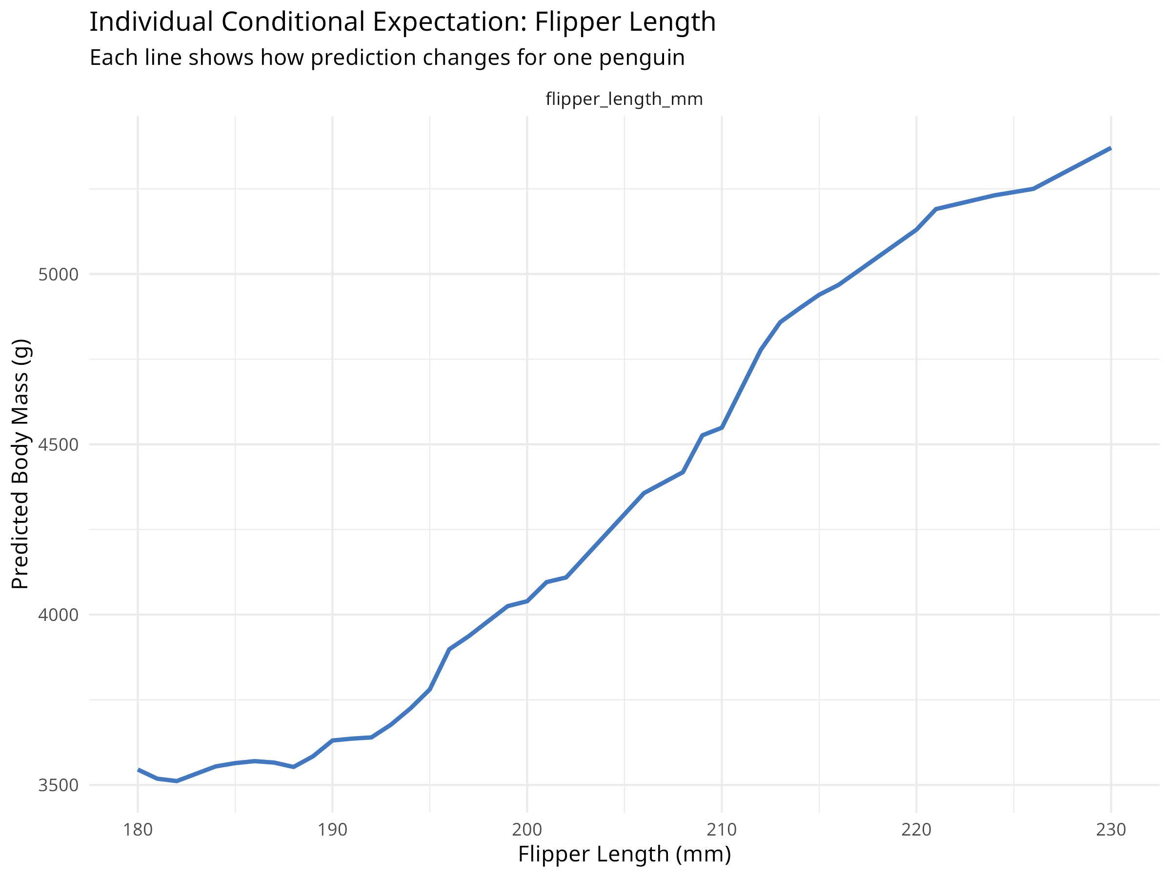
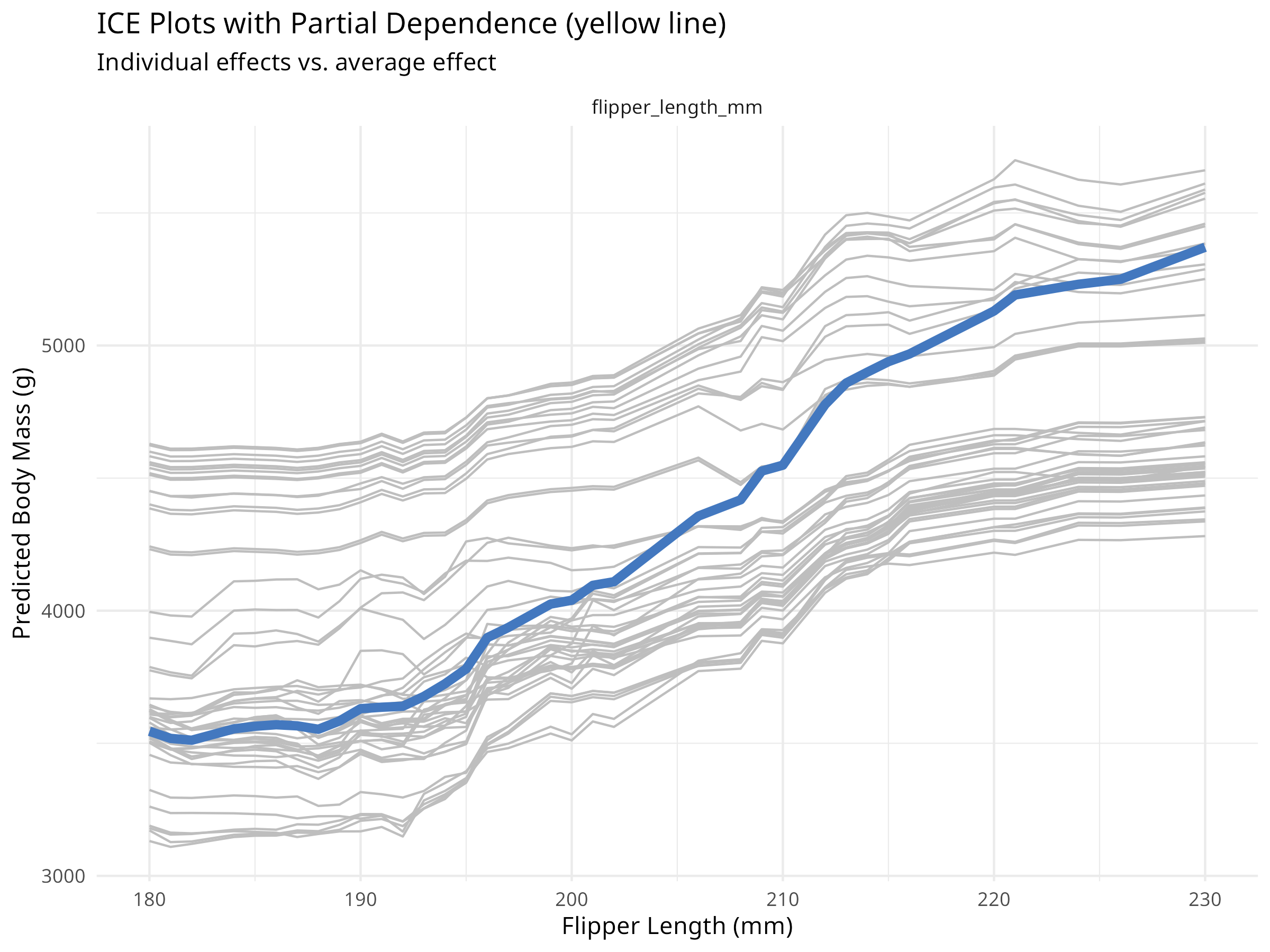
While partial dependence shows average effects, ICE plots show how predictions change for individual observations.
Code
# Create ICE plots for flipper lengthice_flipper<-model_profile(explainer_rf, variables ="flipper_length_mm", N =50, # Use 50 observations for clarity type ="conditional")# Plot ICE curvesplot(ice_flipper)+labs(title ="Individual Conditional Expectation: Flipper Length", subtitle ="Each line shows how prediction changes for one penguin", x ="Flipper Length (mm)", y ="Predicted Body Mass (g)")+theme_minimal()# Compare with partial dependence (average)plot(ice_flipper, geom ="profiles")+labs(title ="ICE Plots with Partial Dependence (yellow line)", subtitle ="Individual effects vs. average effect", x ="Flipper Length (mm)", y ="Predicted Body Mass (g)")+theme_minimal()
Figure 9.5: ICE plots with partial dependence overlay
PROFESSIONAL TIP: Choosing Interpretation Methods
When interpreting machine learning models for ecological applications:
Variable Importance
Use permutation importance for model-agnostic assessment
Compare with domain knowledge to validate model behavior
Consider both statistical and ecological importance
Report confidence intervals when possible
Partial Dependence Plots
Show average marginal effects of predictors
Useful for understanding overall patterns
Can mask heterogeneous effects across observations
Best for communicating general relationships
ICE Plots
Reveal individual-level heterogeneity
Identify subgroups with different response patterns
More complex to interpret than PDP
Useful for detecting interactions
Break-Down Plots (for individual predictions)
Explain specific predictions step-by-step
Useful for understanding outliers or unusual cases
Helps build trust in model predictions
Essential for high-stakes conservation decisions
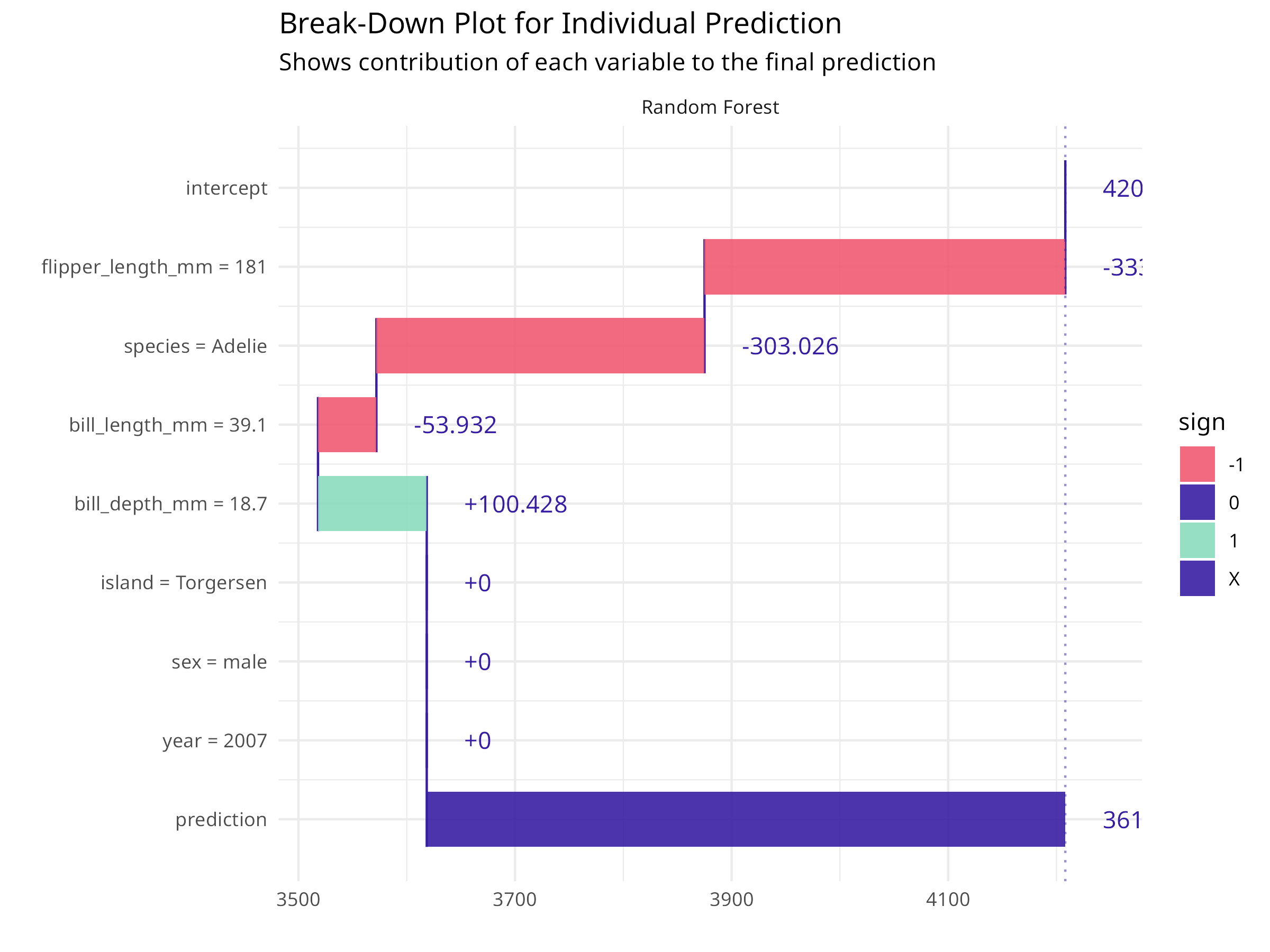
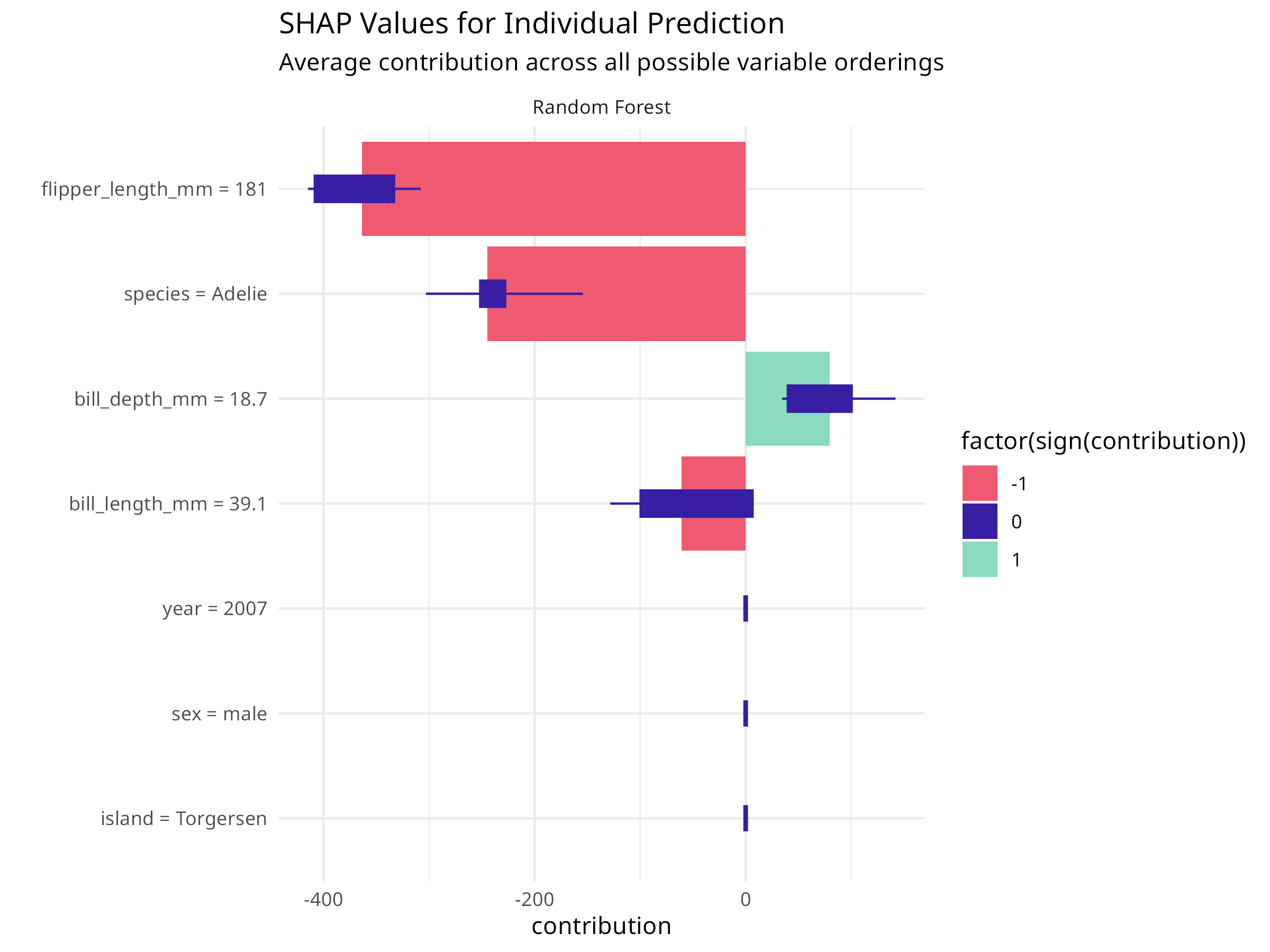
9.2.4 Explaining Individual Predictions
For specific conservation decisions, we often need to understand why the model made a particular prediction.
Code
# Select an interesting observation to explainobservation_to_explain<-penguin_test[1, ]cat("Explaining prediction for:\n")#> Explaining prediction for:print(observation_to_explain%>%select(species, bill_length_mm, bill_depth_mm, flipper_length_mm, body_mass_g))#> # A tibble: 1 × 5#> species bill_length_mm bill_depth_mm flipper_length_mm body_mass_g#> <fct> <dbl> <dbl> <int> <int>#> 1 Adelie 39.1 18.7 181 3750# Create a break-down explanationbd<-predict_parts(explainer_rf, new_observation =observation_to_explain, type ="break_down")# Plot the break-downplot(bd)+labs(title ="Break-Down Plot for Individual Prediction", subtitle ="Shows contribution of each variable to the final prediction")+theme_minimal()# Create SHAP values for more robust attributionshap<-predict_parts(explainer_rf, new_observation =observation_to_explain, type ="shap", B =25# Number of random orderings)# Plot SHAP valuesplot(shap)+labs(title ="SHAP Values for Individual Prediction", subtitle ="Average contribution across all possible variable orderings")+theme_minimal()
Figure 9.6: Break-down plot for individual prediction
Figure 9.7: SHAP values for individual prediction
Code Explanation
Individual prediction explanations help understand specific cases:
Break-Down Plots
Show step-by-step how each variable contributes to the prediction
Start from the average prediction and add each variable’s effect
Order matters: variables are added in order of importance
SHAP Values
Shapley Additive exPlanations from game theory
Average contribution across all possible orderings of variables
More robust than break-down plots but computationally intensive
Provides fair attribution of prediction to each feature
Ecological Applications
Explain why a particular species is predicted in a certain location
Understand which factors drive high/low abundance predictions
Communicate model reasoning to stakeholders and decision-makers
Identify data quality issues or model failures
Communicating ML Results in Ecology
When presenting machine learning results to ecological audiences:
Focus on Ecological Meaning
Translate statistical importance to ecological significance
Connect model patterns to known ecological processes
Discuss biological plausibility of relationships
Relate findings to conservation implications
Visualize Effectively
Use partial dependence plots for main effects
Show uncertainty in predictions
Include actual data points alongside model predictions
Use colors and labels that resonate with ecological context
Acknowledge Limitations
Discuss what the model cannot capture (e.g., biotic interactions)
Explain extrapolation risks
Mention data quality and sampling bias issues
Suggest validation approaches
Provide Actionable Insights
Link predictions to management recommendations
Identify key variables that can be monitored or manipulated
Suggest priority areas for conservation action
Propose adaptive management strategies based on model uncertainty
Model interpretation transforms “black box” machine learning into a tool for ecological understanding. By explaining how models make predictions, we gain insights into ecological processes and build confidence in using ML for conservation decision-making.
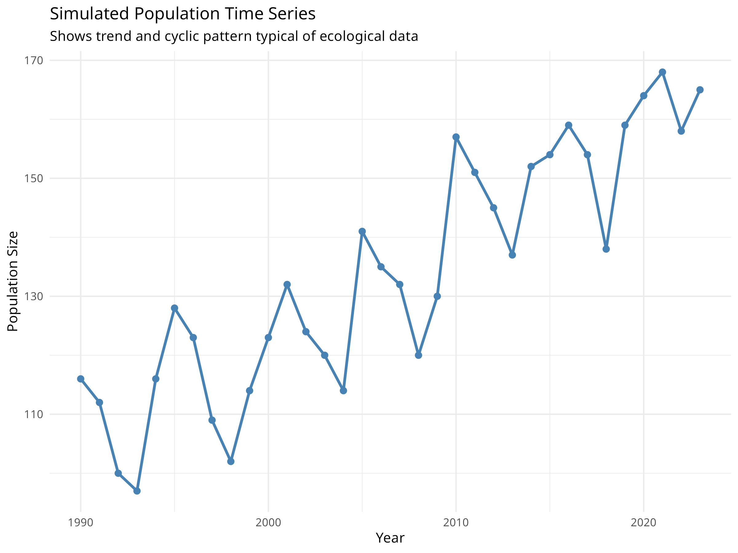
9.3 Time Series Analysis for Ecological Data
Time series data—observations collected sequentially over time—are common in ecology. Population counts, climate measurements, and phenological observations all have temporal structure that standard regression methods cannot properly handle.
9.3.1 Understanding Temporal Autocorrelation
Code
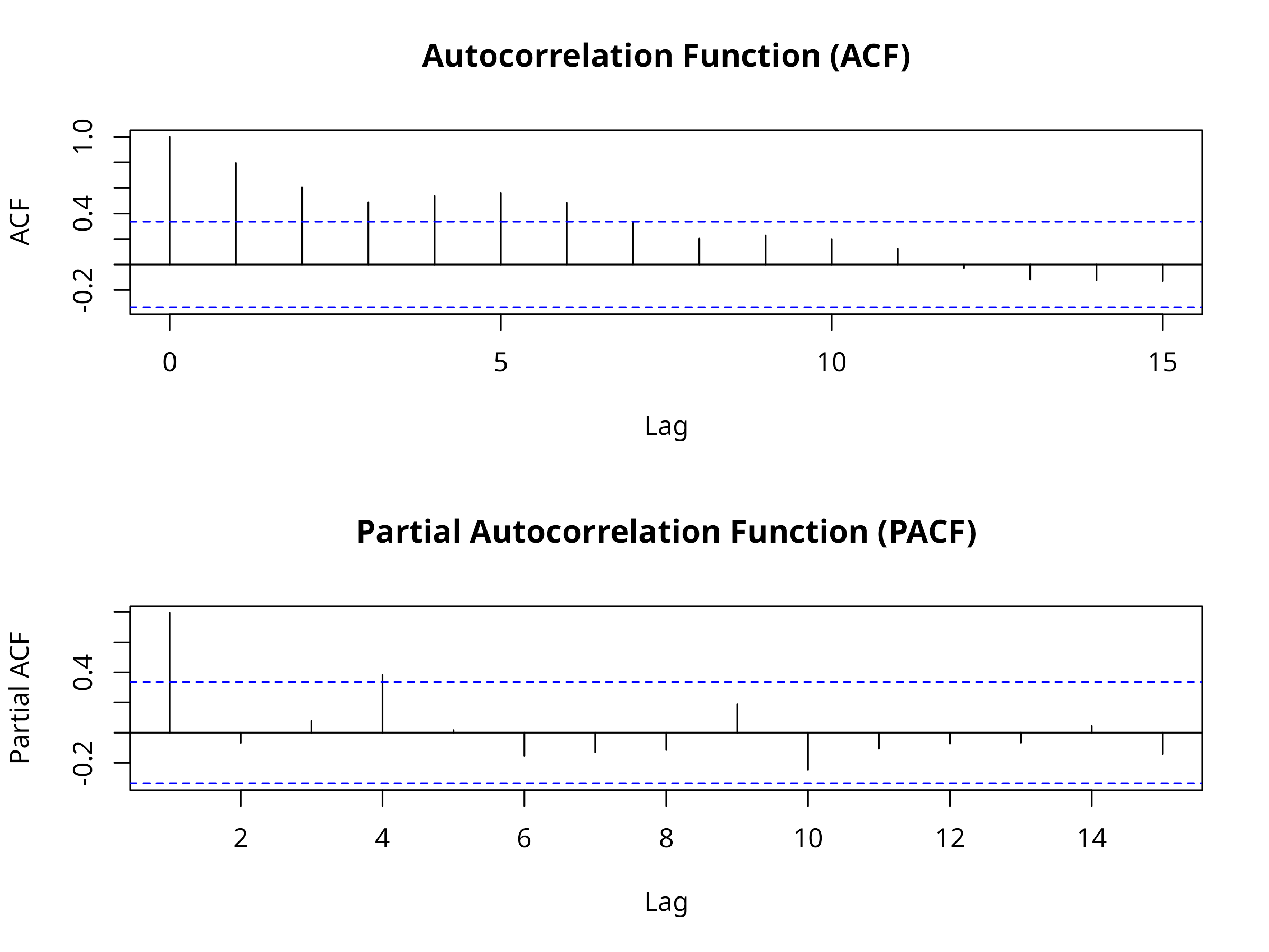
# Load packages for time series analysislibrary(forecast)library(tsibble)library(feasts)library(ggplot2)library(dplyr)# Create simulated population time seriesset.seed(2024)years<-1990:2023n_years<-length(years)# Simulate population with trend, seasonality, and noisetrend<-100+2*(1:n_years)# Increasing trendseasonal<-10*sin(2*pi*(1:n_years)/5)# 5-year cyclenoise<-rnorm(n_years, 0, 5)population<-trend+seasonal+noise# Create time series data framepop_ts_data<-data.frame( year =years, population =round(population))# Visualize the time seriesggplot(pop_ts_data, aes(x =year, y =population))+geom_line(color ="steelblue", linewidth =1)+geom_point(color ="steelblue", size =2)+labs( title ="Simulated Population Time Series", subtitle ="Shows trend and cyclic pattern typical of ecological data", x ="Year", y ="Population Size")+theme_minimal()# Test for temporal autocorrelation# Create ACF and PACF plotspar(mfrow =c(2, 1))acf(pop_ts_data$population, main ="Autocorrelation Function (ACF)")pacf(pop_ts_data$population, main ="Partial Autocorrelation Function (PACF)")
Figure 9.8: Simulated population time series
Figure 9.9: Autocorrelation and partial autocorrelation functions
Code Explanation
This code introduces time series concepts for ecological data:
Time Series Components
Trend: Long-term increase or decrease (e.g., climate change effects)
Noise: Random variation (e.g., environmental stochasticity)
Autocorrelation Functions
ACF: Shows correlation between observations at different time lags
PACF: Shows direct correlation after removing indirect effects
Significant spikes indicate temporal dependence
Ecological Relevance
Population dynamics often show autocorrelation due to age structure
Climate variables have strong seasonal patterns
Ignoring autocorrelation leads to invalid statistical inferences
9.3.2 Time Series Decomposition
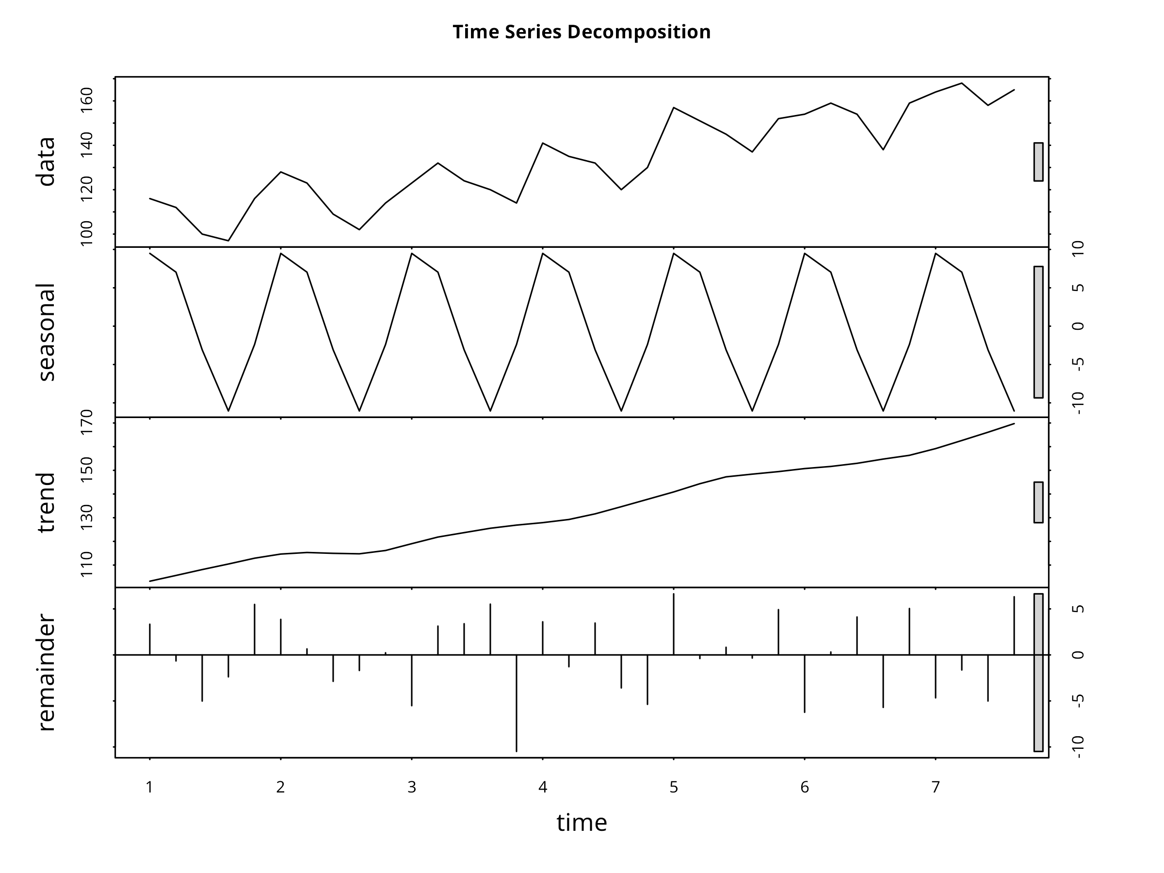
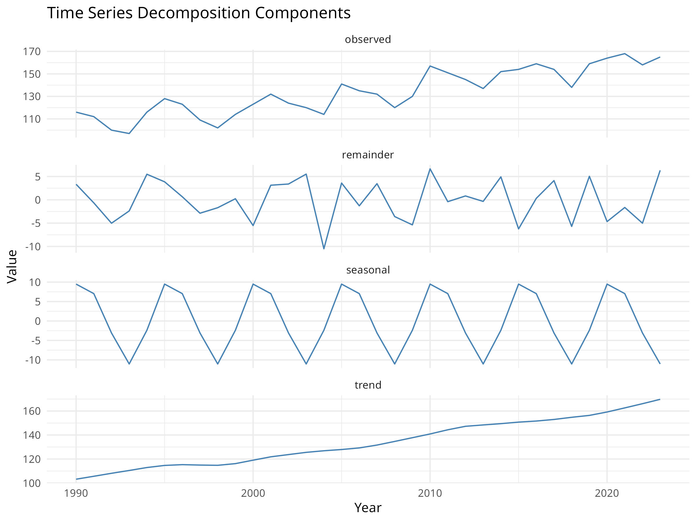
Code
# Convert to ts object for decompositionpop_ts<-ts(pop_ts_data$population, start =1990, frequency =1)# Decompose the time seriesdecomp<-stl(ts(pop_ts_data$population, frequency =5), s.window ="periodic")# Plot decompositionplot(decomp, main ="Time Series Decomposition")# Extract componentstrend_component<-decomp$time.series[, "trend"]seasonal_component<-decomp$time.series[, "seasonal"]remainder<-decomp$time.series[, "remainder"]# Create a data frame for ggplotdecomp_df<-data.frame( year =years, observed =pop_ts_data$population, trend =as.numeric(trend_component), seasonal =as.numeric(seasonal_component), remainder =as.numeric(remainder))# Visualize components with ggplotlibrary(tidyr)decomp_long<-decomp_df%>%pivot_longer(cols =c(observed, trend, seasonal, remainder), names_to ="component", values_to ="value")ggplot(decomp_long, aes(x =year, y =value))+geom_line(color ="steelblue")+facet_wrap(~component, scales ="free_y", ncol =1)+labs( title ="Time Series Decomposition Components", x ="Year", y ="Value")+theme_minimal()
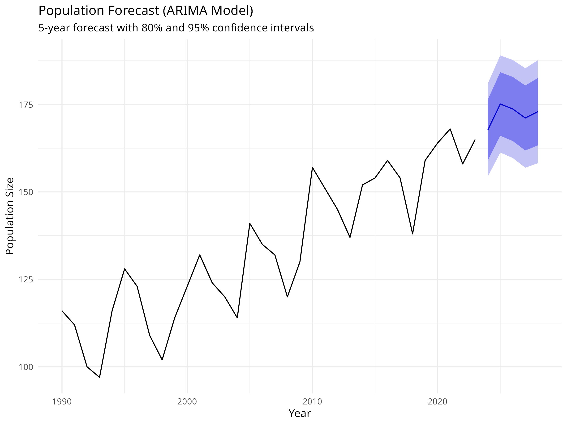
Consider seasonal ARIMA for data with clear seasonality
Evaluate multiple models and compare AIC/BIC
Check residual diagnostics to validate model assumptions
Forecast Interpretation
Point forecasts are the expected values
Confidence intervals quantify uncertainty
Uncertainty increases with forecast horizon
Consider biological constraints (e.g., populations can’t be negative)
Ecological Considerations
Short-term forecasts are more reliable than long-term
Regime shifts or environmental changes can invalidate models
Incorporate external covariates when available (e.g., climate indices)
Use ensemble forecasts for robust predictions
Communication
Always show uncertainty in forecasts
Explain assumptions and limitations
Relate forecasts to management thresholds
Update forecasts as new data become available
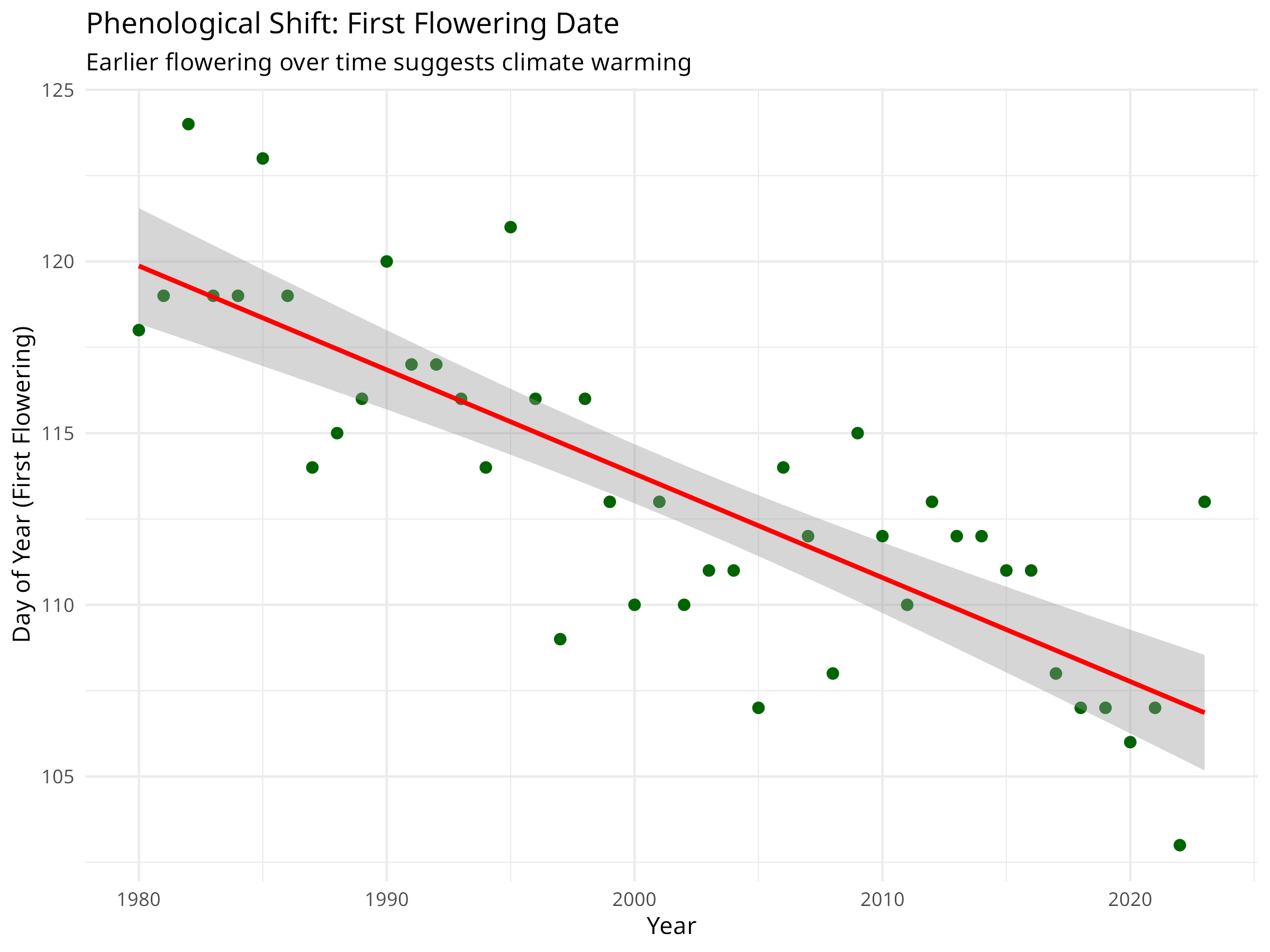
9.3.4 Ecological Example: Phenology Trends
Code
library(lmtest)# For dwtest()# Simulate phenological data (e.g., first flowering date)set.seed(123)years_pheno<-1980:2023n_years_pheno<-length(years_pheno)# Earlier flowering over time due to climate changeflowering_doy<-120-0.3*(1:n_years_pheno)+rnorm(n_years_pheno, 0, 3)pheno_data<-data.frame( year =years_pheno, flowering_day =round(flowering_doy))# Visualize the trendggplot(pheno_data, aes(x =year, y =flowering_day))+geom_point(color ="darkgreen", size =2)+geom_smooth(method ="lm", color ="red", se =TRUE)+labs( title ="Phenological Shift: First Flowering Date", subtitle ="Earlier flowering over time suggests climate warming", x ="Year", y ="Day of Year (First Flowering)")+theme_minimal()# Fit a linear model to quantify the trendpheno_model<-lm(flowering_day~year, data =pheno_data)summary(pheno_model)#> #> Call:#> lm(formula = flowering_day ~ year, data = pheno_data)#> #> Residuals:#> Min 1Q Median 3Q Max #> -5.7254 -1.6662 -0.2123 1.7907 6.1424 #> #> Coefficients:#> Estimate Std. Error t value Pr(>|t|) #> (Intercept) 719.0325 66.8573 10.755 1.22e-13 ***#> year -0.3026 0.0334 -9.059 1.97e-11 ***#> ---#> Signif. codes: 0 '***' 0.001 '**' 0.01 '*' 0.05 '.' 0.1 ' ' 1#> #> Residual standard error: 2.814 on 42 degrees of freedom#> Multiple R-squared: 0.6615, Adjusted R-squared: 0.6534 #> F-statistic: 82.07 on 1 and 42 DF, p-value: 1.967e-11# Calculate the rate of changerate_per_decade<-coef(pheno_model)["year"]*10cat(sprintf("Flowering is occurring %.2f days earlier per decade\n", abs(rate_per_decade)))#> Flowering is occurring 3.03 days earlier per decade# Test for autocorrelation in residualsdwtest(pheno_model)#> #> Durbin-Watson test#> #> data: pheno_model#> DW = 1.9126, p-value = 0.3252#> alternative hypothesis: true autocorrelation is greater than 0# If autocorrelation is present, use GLSlibrary(nlme)gls_model<-gls(flowering_day~year, correlation =corAR1(form =~year), data =pheno_data)summary(gls_model)#> Generalized least squares fit by REML#> Model: flowering_day ~ year #> Data: pheno_data #> AIC BIC logLik#> 226.6999 233.6506 -109.35#> #> Correlation Structure: AR(1)#> Formula: ~year #> Parameter estimate(s):#> Phi #> 0.03243688 #> #> Coefficients:#> Value Std.Error t-value p-value#> (Intercept) 717.3361 69.01309 10.394204 0#> year -0.3018 0.03448 -8.751694 0#> #> Correlation: #> (Intr)#> year -1 #> #> Standardized residuals:#> Min Q1 Med Q3 Max #> -2.03150156 -0.59213522 -0.07665248 0.63090321 2.17206766 #> #> Residual standard error: 2.818014 #> Degrees of freedom: 44 total; 42 residual
Figure 9.13: Phenological shift: First flowering date over time
Phenological Trends and Climate Change
Phenological shifts provide powerful evidence of climate change impacts:
Trend Detection
Linear regression can detect long-term trends
Rate of change quantifies the magnitude of shifts
Statistical significance indicates confidence in the trend
Temporal Autocorrelation
Phenological data often show autocorrelation
Durbin-Watson test detects autocorrelation in residuals
Generalized Least Squares (GLS) accounts for autocorrelation
Proper modeling prevents inflated Type I error rates
Ecological Implications
Earlier flowering can lead to phenological mismatches
Pollinators may not be active when plants flower
Affects reproductive success and population dynamics
Indicates ecosystem-wide climate change responses
Conservation Applications
Monitor phenological shifts as climate change indicators
Identify species vulnerable to phenological mismatches
Inform assisted migration decisions
Guide adaptive management strategies
Code Explanation
The phenology example demonstrates practical time series analysis:
Trend Analysis
Linear regression quantifies the rate of phenological shift
Confidence intervals indicate precision of the estimate
Visual inspection confirms the trend pattern
Autocorrelation Testing
Durbin-Watson test checks for temporal autocorrelation
GLS with AR(1) correlation structure accounts for autocorrelation
Model Comparison
Compare standard linear model with GLS
GLS provides more accurate standard errors
Prevents false positives in trend detection
Time series analysis is essential for understanding temporal dynamics in ecological systems. By properly accounting for temporal structure, we can detect trends, make forecasts, and understand how ecosystems respond to environmental change.
9.4 Chapter Summary
9.4.1 Key Concepts
Model Interpretation: DALEX framework provides model-agnostic interpretation methods
This chapter explores advanced modeling techniques that extend beyond traditional regression (covered in Chapter 8). We’ll cover model interpretation methods that help us understand “black box” machine learning models, and time series analysis for data collected sequentially over time.
9.4.3 Next Steps
Congratulations on completing Data Analysis in Natural Sciences! You now possess a comprehensive toolkit for analyzing ecological data, from data cleaning and visualization to advanced modeling and interpretation.
To continue your journey: - Apply these techniques to your own datasets - Explore the documentation for packages like tidymodels, DALEX, and fable - Join the R for Data Science community to keep learning - Contribute to open-source projects in ecology and conservation
Model Interpretation: Use DALEX to interpret a random forest model predicting species abundance. Which environmental variables are most important?
Partial Dependence: Create partial dependence plots for the top 3 most important variables. Do the relationships make ecological sense?
Individual Predictions: Select an unusual prediction (outlier) and use SHAP values to explain why the model made that prediction.
Time Series Decomposition: Analyze a real ecological time series (e.g., population counts, temperature data). Decompose it and interpret the components.
ARIMA Forecasting: Build an ARIMA model for a population time series. How far into the future can you reliably forecast?
Phenology Analysis: Analyze phenological data (e.g., bird arrival dates, flowering times) for evidence of climate change. Account for temporal autocorrelation.
Model Comparison: Compare interpretations from different ML models (random forest, gradient boosting, neural network) on the same dataset. Do they agree on variable importance?
Ensemble Interpretation: Create an ensemble model and interpret it. How does the interpretation differ from individual models?
Source Code
---prefer-html: true---# Advanced Modeling Techniques {#sec-advanced-modeling}::: {.callout-note}## Learning ObjectivesBy the end of this chapter, you will be able to:1. Interpret machine learning models using model-agnostic methods2. Calculate and visualize variable importance3. Create partial dependence and ICE plots4. Explain individual predictions with SHAP values5. Analyze time series data with temporal autocorrelation6. Decompose time series into trend, seasonal, and noise components7. Build ARIMA models for forecasting8. Account for temporal autocorrelation in regression models:::## IntroductionThis chapter explores advanced modeling techniques that extend beyond traditional regression. We'll cover model interpretation methods that help us understand "black box" machine learning models, and time series analysis for data collected sequentially over time.## Model Interpretation and ExplainabilityWhile machine learning models like Random Forest can achieve high predictive accuracy, understanding *why* they make specific predictions is crucial for ecological applications. Model interpretation helps us extract ecological insights and communicate results to stakeholders.### Variable Importance```{r}#| label: fig-variable-importance#| message: false#| warning: false#| fig-cap: "Variable importance for body mass prediction"# Load packages for model interpretationlibrary(DALEX)library(DALEXtra)library(tidymodels)library(palmerpenguins)# Prepare the penguins data (same as chapter 08)penguins <- palmerpenguins::penguins %>%drop_na()# Split data into training and testing setsset.seed(123)penguin_split <-initial_split(penguins, prop =0.75, strata = species)penguin_train <-training(penguin_split)penguin_test <-testing(penguin_split)# Define a recipe for preprocessingpenguin_recipe <-recipe(body_mass_g ~ bill_length_mm + bill_depth_mm + flipper_length_mm + species,data = penguin_train) %>%step_dummy(species) %>%step_normalize(all_numeric_predictors()) %>%step_zv(all_predictors())# Define Random Forest model specificationrf_spec <-rand_forest(trees =100) %>%set_engine("ranger") %>%set_mode("regression")# Create workflowrf_wf <-workflow() %>%add_recipe(penguin_recipe) %>%add_model(rf_spec)# Fit the final modelfinal_fit <- rf_wf %>%fit(data = penguin_train)# Create an explainer objectexplainer_rf <-explain_tidymodels( final_fit,data = penguin_test %>%select(-body_mass_g),y = penguin_test$body_mass_g,label ="Random Forest",verbose =FALSE)# Calculate variable importance using permutationvi_rf <-model_parts(explainer_rf, loss_function = loss_root_mean_square)# Visualize variable importanceplot(vi_rf) +labs(title ="Variable Importance for Body Mass Prediction",subtitle ="Permutation-based importance shows contribution of each predictor") +theme_minimal()# Get the importance valuesvi_df <-as.data.frame(vi_rf)vi_summary <- vi_df %>%filter(variable !="_baseline_", variable !="_full_model_") %>%group_by(variable) %>%summarize(mean_dropout_loss =mean(dropout_loss),.groups ="drop" ) %>%arrange(desc(mean_dropout_loss))print(vi_summary)```::: {.callout-note}## Code ExplanationThis code demonstrates model-agnostic variable importance:1. **DALEX Framework** - Creates an "explainer" object that wraps the tidymodels workflow - Provides a unified interface for model interpretation - Works with any model type (linear, tree-based, neural networks)2. **Permutation Importance** - Measures how much model performance decreases when a variable is randomly shuffled - Higher dropout loss = more important variable - Unlike tree-based importance, this works for any model and accounts for correlations3. **Interpretation** - Variables are ranked by their contribution to predictions - Helps identify which morphological features are most predictive of body mass - Provides ecological insights into species morphology:::### Partial Dependence PlotsPartial dependence plots show how predictions change as a single variable varies, while averaging over all other variables.```{r}#| label: fig-partial-dependence#| fig-cap:#| - "Partial dependence: Flipper length"#| - "Partial dependence: Bill length"# Create partial dependence profiles for key variablespdp_flipper <-model_profile( explainer_rf,variables ="flipper_length_mm",N =NULL# Use all observations)pdp_bill <-model_profile( explainer_rf,variables ="bill_length_mm",N =NULL)# Plot partial dependenceplot(pdp_flipper) +labs(title ="Partial Dependence: Flipper Length",subtitle ="Shows average effect of flipper length on predicted body mass",x ="Flipper Length (mm)",y ="Predicted Body Mass (g)") +theme_minimal()plot(pdp_bill) +labs(title ="Partial Dependence: Bill Length",subtitle ="Shows average effect of bill length on predicted body mass",x ="Bill Length (mm)",y ="Predicted Body Mass (g)") +theme_minimal()# Create 2D partial dependence plot for interactionspdp_2d <-model_profile( explainer_rf,variables =c("flipper_length_mm", "bill_length_mm"),N =100)# Note: 2D plots require additional processing# For simplicity, we'll show individual effects```::: {.callout-important}## Results InterpretationPartial dependence plots reveal important ecological relationships:1. **Marginal Effects** - Shows how each predictor affects the response on average - Accounts for correlations between predictors - Reveals non-linear relationships that linear models would miss2. **Ecological Insights** - Flipper length typically shows a strong positive relationship with body mass - The relationship may be non-linear (e.g., diminishing returns at large sizes) - Different species may show different patterns (captured by species variable)3. **Model Behavior** - Helps validate that the model learned sensible relationships - Can reveal unexpected patterns that warrant further investigation - Useful for communicating model predictions to non-technical audiences:::### Individual Conditional Expectation (ICE) PlotsWhile partial dependence shows average effects, ICE plots show how predictions change for individual observations.```{r}#| label: fig-ice-plots#| fig-cap:#| - "Individual conditional expectation curves"#| - "ICE plots with partial dependence overlay"# Create ICE plots for flipper lengthice_flipper <-model_profile( explainer_rf,variables ="flipper_length_mm",N =50, # Use 50 observations for claritytype ="conditional")# Plot ICE curvesplot(ice_flipper) +labs(title ="Individual Conditional Expectation: Flipper Length",subtitle ="Each line shows how prediction changes for one penguin",x ="Flipper Length (mm)",y ="Predicted Body Mass (g)") +theme_minimal()# Compare with partial dependence (average)plot(ice_flipper, geom ="profiles") +labs(title ="ICE Plots with Partial Dependence (yellow line)",subtitle ="Individual effects vs. average effect",x ="Flipper Length (mm)",y ="Predicted Body Mass (g)") +theme_minimal()```::: {.callout-tip}## PROFESSIONAL TIP: Choosing Interpretation MethodsWhen interpreting machine learning models for ecological applications:1. **Variable Importance** - Use permutation importance for model-agnostic assessment - Compare with domain knowledge to validate model behavior - Consider both statistical and ecological importance - Report confidence intervals when possible2. **Partial Dependence Plots** - Show average marginal effects of predictors - Useful for understanding overall patterns - Can mask heterogeneous effects across observations - Best for communicating general relationships3. **ICE Plots** - Reveal individual-level heterogeneity - Identify subgroups with different response patterns - More complex to interpret than PDP - Useful for detecting interactions4. **Break-Down Plots** (for individual predictions) - Explain specific predictions step-by-step - Useful for understanding outliers or unusual cases - Helps build trust in model predictions - Essential for high-stakes conservation decisions:::### Explaining Individual PredictionsFor specific conservation decisions, we often need to understand why the model made a particular prediction.```{r}#| label: fig-individual-predictions#| fig-cap:#| - "Break-down plot for individual prediction"#| - "SHAP values for individual prediction"# Select an interesting observation to explainobservation_to_explain <- penguin_test[1, ]cat("Explaining prediction for:\n")print(observation_to_explain %>%select(species, bill_length_mm, bill_depth_mm, flipper_length_mm, body_mass_g))# Create a break-down explanationbd <-predict_parts( explainer_rf,new_observation = observation_to_explain,type ="break_down")# Plot the break-downplot(bd) +labs(title ="Break-Down Plot for Individual Prediction",subtitle ="Shows contribution of each variable to the final prediction") +theme_minimal()# Create SHAP values for more robust attributionshap <-predict_parts( explainer_rf,new_observation = observation_to_explain,type ="shap",B =25# Number of random orderings)# Plot SHAP valuesplot(shap) +labs(title ="SHAP Values for Individual Prediction",subtitle ="Average contribution across all possible variable orderings") +theme_minimal()```::: {.callout-note}## Code ExplanationIndividual prediction explanations help understand specific cases:1. **Break-Down Plots** - Show step-by-step how each variable contributes to the prediction - Start from the average prediction and add each variable's effect - Order matters: variables are added in order of importance2. **SHAP Values** - Shapley Additive exPlanations from game theory - Average contribution across all possible orderings of variables - More robust than break-down plots but computationally intensive - Provides fair attribution of prediction to each feature3. **Ecological Applications** - Explain why a particular species is predicted in a certain location - Understand which factors drive high/low abundance predictions - Communicate model reasoning to stakeholders and decision-makers - Identify data quality issues or model failures:::::: {.callout-important}## Communicating ML Results in EcologyWhen presenting machine learning results to ecological audiences:1. **Focus on Ecological Meaning** - Translate statistical importance to ecological significance - Connect model patterns to known ecological processes - Discuss biological plausibility of relationships - Relate findings to conservation implications2. **Visualize Effectively** - Use partial dependence plots for main effects - Show uncertainty in predictions - Include actual data points alongside model predictions - Use colors and labels that resonate with ecological context3. **Acknowledge Limitations** - Discuss what the model cannot capture (e.g., biotic interactions) - Explain extrapolation risks - Mention data quality and sampling bias issues - Suggest validation approaches4. **Provide Actionable Insights** - Link predictions to management recommendations - Identify key variables that can be monitored or manipulated - Suggest priority areas for conservation action - Propose adaptive management strategies based on model uncertainty:::Model interpretation transforms "black box" machine learning into a tool for ecological understanding. By explaining how models make predictions, we gain insights into ecological processes and build confidence in using ML for conservation decision-making.## Time Series Analysis for Ecological DataTime series data—observations collected sequentially over time—are common in ecology. Population counts, climate measurements, and phenological observations all have temporal structure that standard regression methods cannot properly handle.### Understanding Temporal Autocorrelation```{r}#| label: fig-time-series-intro#| warning: false#| message: false#| fig-cap:#| - "Simulated population time series"#| - "Autocorrelation and partial autocorrelation functions"# Load packages for time series analysislibrary(forecast)library(tsibble)library(feasts)library(ggplot2)library(dplyr)# Create simulated population time seriesset.seed(2024)years <-1990:2023n_years <-length(years)# Simulate population with trend, seasonality, and noisetrend <-100+2* (1:n_years) # Increasing trendseasonal <-10*sin(2* pi * (1:n_years) /5) # 5-year cyclenoise <-rnorm(n_years, 0, 5)population <- trend + seasonal + noise# Create time series data framepop_ts_data <-data.frame(year = years,population =round(population))# Visualize the time seriesggplot(pop_ts_data, aes(x = year, y = population)) +geom_line(color ="steelblue", linewidth =1) +geom_point(color ="steelblue", size =2) +labs(title ="Simulated Population Time Series",subtitle ="Shows trend and cyclic pattern typical of ecological data",x ="Year",y ="Population Size" ) +theme_minimal()# Test for temporal autocorrelation# Create ACF and PACF plotspar(mfrow =c(2, 1))acf(pop_ts_data$population, main ="Autocorrelation Function (ACF)")pacf(pop_ts_data$population, main ="Partial Autocorrelation Function (PACF)")```::: {.callout-note}## Code ExplanationThis code introduces time series concepts for ecological data:1. **Time Series Components** - **Trend**: Long-term increase or decrease (e.g., climate change effects) - **Seasonality**: Regular cyclic patterns (e.g., annual breeding cycles) - **Noise**: Random variation (e.g., environmental stochasticity)2. **Autocorrelation Functions** - **ACF**: Shows correlation between observations at different time lags - **PACF**: Shows direct correlation after removing indirect effects - Significant spikes indicate temporal dependence3. **Ecological Relevance** - Population dynamics often show autocorrelation due to age structure - Climate variables have strong seasonal patterns - Ignoring autocorrelation leads to invalid statistical inferences:::### Time Series Decomposition```{r}#| label: fig-time-series-decomposition#| fig-cap:#| - "Time series decomposition"#| - "Decomposition components visualization"# Convert to ts object for decompositionpop_ts <-ts(pop_ts_data$population, start =1990, frequency =1)# Decompose the time seriesdecomp <-stl(ts(pop_ts_data$population, frequency =5), s.window ="periodic")# Plot decompositionplot(decomp, main ="Time Series Decomposition")# Extract componentstrend_component <- decomp$time.series[, "trend"]seasonal_component <- decomp$time.series[, "seasonal"]remainder <- decomp$time.series[, "remainder"]# Create a data frame for ggplotdecomp_df <-data.frame(year = years,observed = pop_ts_data$population,trend =as.numeric(trend_component),seasonal =as.numeric(seasonal_component),remainder =as.numeric(remainder))# Visualize components with ggplotlibrary(tidyr)decomp_long <- decomp_df %>%pivot_longer(cols =c(observed, trend, seasonal, remainder),names_to ="component",values_to ="value")ggplot(decomp_long, aes(x = year, y = value)) +geom_line(color ="steelblue") +facet_wrap(~component, scales ="free_y", ncol =1) +labs(title ="Time Series Decomposition Components",x ="Year",y ="Value" ) +theme_minimal()```::: {.callout-important}## Results InterpretationTime series decomposition reveals the structure of temporal data:1. **Trend Component** - Shows the long-term direction of the population - Increasing trend suggests population growth - Can be linear or non-linear - Important for long-term conservation planning2. **Seasonal Component** - Reveals cyclic patterns in the data - In this example, shows a 5-year cycle - Could represent environmental cycles (e.g., El Niño) - Helps identify optimal monitoring times3. **Remainder (Residuals)** - Random variation after removing trend and seasonality - Should be approximately white noise if decomposition is appropriate - Large residuals may indicate unusual events or data quality issues4. **Ecological Applications** - Separate long-term trends from natural cycles - Identify critical periods in species life cycles - Detect anomalies or regime shifts - Inform sampling design for monitoring programs:::### Forecasting with ARIMA Models```{r}#| label: fig-arima-forecast#| fig-cap: "Population forecast with ARIMA model"# Fit an ARIMA model# auto.arima selects the best model automaticallyarima_model <-auto.arima(pop_ts)# Display model summarysummary(arima_model)# Make forecasts for the next 5 yearsforecast_result <-forecast(arima_model, h =5)# Plot the forecastautoplot(forecast_result) +labs(title ="Population Forecast (ARIMA Model)",subtitle ="5-year forecast with 80% and 95% confidence intervals",x ="Year",y ="Population Size" ) +theme_minimal()# Extract forecast valuesforecast_df <-data.frame(year =2024:2028,point_forecast =as.numeric(forecast_result$mean),lower_80 =as.numeric(forecast_result$lower[, 1]),upper_80 =as.numeric(forecast_result$upper[, 1]),lower_95 =as.numeric(forecast_result$lower[, 2]),upper_95 =as.numeric(forecast_result$upper[, 2]))print(forecast_df)```::: {.callout-tip}## PROFESSIONAL TIP: Time Series Forecasting in EcologyWhen forecasting ecological time series:1. **Model Selection** - Use `auto.arima()` for automatic model selection - Consider seasonal ARIMA for data with clear seasonality - Evaluate multiple models and compare AIC/BIC - Check residual diagnostics to validate model assumptions2. **Forecast Interpretation** - Point forecasts are the expected values - Confidence intervals quantify uncertainty - Uncertainty increases with forecast horizon - Consider biological constraints (e.g., populations can't be negative)3. **Ecological Considerations** - Short-term forecasts are more reliable than long-term - Regime shifts or environmental changes can invalidate models - Incorporate external covariates when available (e.g., climate indices) - Use ensemble forecasts for robust predictions4. **Communication** - Always show uncertainty in forecasts - Explain assumptions and limitations - Relate forecasts to management thresholds - Update forecasts as new data become available:::### Ecological Example: Phenology Trends```{r}#| label: fig-phenology-trends#| warning: false#| message: false#| fig-cap: "Phenological shift: First flowering date over time"library(lmtest) # For dwtest()# Simulate phenological data (e.g., first flowering date)set.seed(123)years_pheno <-1980:2023n_years_pheno <-length(years_pheno)# Earlier flowering over time due to climate changeflowering_doy <-120-0.3* (1:n_years_pheno) +rnorm(n_years_pheno, 0, 3)pheno_data <-data.frame(year = years_pheno,flowering_day =round(flowering_doy))# Visualize the trendggplot(pheno_data, aes(x = year, y = flowering_day)) +geom_point(color ="darkgreen", size =2) +geom_smooth(method ="lm", color ="red", se =TRUE) +labs(title ="Phenological Shift: First Flowering Date",subtitle ="Earlier flowering over time suggests climate warming",x ="Year",y ="Day of Year (First Flowering)" ) +theme_minimal()# Fit a linear model to quantify the trendpheno_model <-lm(flowering_day ~ year, data = pheno_data)summary(pheno_model)# Calculate the rate of changerate_per_decade <-coef(pheno_model)["year"] *10cat(sprintf("Flowering is occurring %.2f days earlier per decade\n", abs(rate_per_decade)))# Test for autocorrelation in residualsdwtest(pheno_model)# If autocorrelation is present, use GLSlibrary(nlme)gls_model <-gls(flowering_day ~ year,correlation =corAR1(form =~ year),data = pheno_data)summary(gls_model)```::: {.callout-important}## Phenological Trends and Climate ChangePhenological shifts provide powerful evidence of climate change impacts:1. **Trend Detection** - Linear regression can detect long-term trends - Rate of change quantifies the magnitude of shifts - Statistical significance indicates confidence in the trend2. **Temporal Autocorrelation** - Phenological data often show autocorrelation - Durbin-Watson test detects autocorrelation in residuals - Generalized Least Squares (GLS) accounts for autocorrelation - Proper modeling prevents inflated Type I error rates3. **Ecological Implications** - Earlier flowering can lead to phenological mismatches - Pollinators may not be active when plants flower - Affects reproductive success and population dynamics - Indicates ecosystem-wide climate change responses4. **Conservation Applications** - Monitor phenological shifts as climate change indicators - Identify species vulnerable to phenological mismatches - Inform assisted migration decisions - Guide adaptive management strategies:::::: {.callout-note}## Code ExplanationThe phenology example demonstrates practical time series analysis:1. **Trend Analysis** - Linear regression quantifies the rate of phenological shift - Confidence intervals indicate precision of the estimate - Visual inspection confirms the trend pattern2. **Autocorrelation Testing** - Durbin-Watson test checks for temporal autocorrelation - Significant autocorrelation requires specialized models - GLS with AR(1) correlation structure accounts for autocorrelation3. **Model Comparison** - Compare standard linear model with GLS - GLS provides more accurate standard errors - Prevents false positives in trend detection:::Time series analysis is essential for understanding temporal dynamics in ecological systems. By properly accounting for temporal structure, we can detect trends, make forecasts, and understand how ecosystems respond to environmental change.## Chapter Summary### Key Concepts- **Model Interpretation**: DALEX framework provides model-agnostic interpretation methods- **Variable Importance**: Permutation importance quantifies predictor contributions- **Partial Dependence**: Shows average marginal effects of predictors- **ICE Plots**: Reveal individual-level heterogeneity in predictions- **SHAP Values**: Provide fair attribution of predictions to features- **Temporal Autocorrelation**: Nearby time points are often correlated- **Time Series Decomposition**: Separates trend, seasonal, and noise components- **ARIMA Models**: Flexible framework for time series forecasting- **GLS Models**: Account for temporal autocorrelation in regression### R Functions Learned- `explain_tidymodels()` - Create DALEX explainer for tidymodels- `model_parts()` - Calculate variable importance- `model_profile()` - Create partial dependence and ICE plots- `predict_parts()` - Explain individual predictions- `auto.arima()` - Automatic ARIMA model selection- `forecast()` - Generate forecasts## IntroductionThis chapter explores advanced modeling techniques that extend beyond traditional regression (covered in [Chapter 8](08-regression.qmd)). We'll cover model interpretation methods that help us understand "black box" machine learning models, and time series analysis for data collected sequentially over time.### Next StepsCongratulations on completing *Data Analysis in Natural Sciences*! You now possess a comprehensive toolkit for analyzing ecological data, from data cleaning and visualization to advanced modeling and interpretation.To continue your journey:- Apply these techniques to your own datasets- Explore the documentation for packages like `tidymodels`, `DALEX`, and `fable`- Join the R for Data Science community to keep learning- Contribute to open-source projects in ecology and conservationFor applied examples in conservation science, check out [Chapter 10: Conservation Applications](10-conservation.qmd).## Exercises1. **Model Interpretation**: Use DALEX to interpret a random forest model predicting species abundance. Which environmental variables are most important?2. **Partial Dependence**: Create partial dependence plots for the top 3 most important variables. Do the relationships make ecological sense?3. **Individual Predictions**: Select an unusual prediction (outlier) and use SHAP values to explain why the model made that prediction.4. **Time Series Decomposition**: Analyze a real ecological time series (e.g., population counts, temperature data). Decompose it and interpret the components.5. **ARIMA Forecasting**: Build an ARIMA model for a population time series. How far into the future can you reliably forecast?6. **Phenology Analysis**: Analyze phenological data (e.g., bird arrival dates, flowering times) for evidence of climate change. Account for temporal autocorrelation.7. **Model Comparison**: Compare interpretations from different ML models (random forest, gradient boosting, neural network) on the same dataset. Do they agree on variable importance?8. **Ensemble Interpretation**: Create an ensemble model and interpret it. How does the interpretation differ from individual models?