Data visualization is a crucial skill for communicating scientific findings effectively. In this chapter, you will:
Learn various data visualization techniques
Gain expertise in creating informative graphs and plots
Understand the role of visualization in conveying insights clearly in natural sciences
6.2 The Importance of Data Visualization
6.2.1 Why Data Visualization Matters
Data visualization plays a pivotal role in natural sciences research for several reasons:
Pattern Recognition: Visualizations make it easier to identify patterns, trends, and anomalies in data. This can reveal phenomena like population fluctuations, species distributions, or the impact of environmental factors.
Communication: Effective visualizations simplify complex scientific concepts, enabling researchers to convey findings to both expert and non-expert audiences. This is particularly valuable when sharing results with policymakers, stakeholders, or the general public.
Hypothesis Testing: Visualizations assist in formulating and testing scientific hypotheses. Researchers can visually explore data distributions, relationships, and spatial patterns, which informs the design of hypothesis tests.
Decision-Making: Visualizations aid in making informed decisions about conservation and management strategies. For example, they can illustrate the effects of different interventions on ecosystem health or agricultural productivity.
6.2.2 Types of Scientific Data
Data in natural sciences come in various forms, including:
Categorical Data: These represent qualitative characteristics, such as species names, habitat types, or land-use categories. Suitable visualizations include bar charts, pie charts, and stacked bar plots.
Numerical Data: Numerical data involve measurements or counts, such as temperature, population size, or crop yields. Histograms, scatter plots, and box plots are useful for visualizing numerical data.
Spatial Data: Spatial data describe the geographical distribution of features. Maps, heatmaps, and spatial plots help visualize these data effectively, allowing researchers to observe spatial patterns and trends.
PROFESSIONAL TIP: Principles of Effective Scientific Visualization
When creating visualizations for scientific publications or presentations:
Choose the right plot type: Match your visualization to your data type and research question
Prioritize clarity over complexity: A simple, clear visualization is better than a complex, confusing one
Maintain data integrity: Never distort data through misleading scales, truncated axes, or cherry-picked views
Design for accessibility: Use colorblind-friendly palettes (viridis, cividis, or ColorBrewer schemes)
Follow journal standards: Check target journal guidelines for figure specifications before submission
Include uncertainty: Always visualize error bars, confidence intervals, or other measures of uncertainty
Label thoroughly: Every axis should have clear labels with units; legends should be comprehensive
Consider the narrative: Ensure your visualization supports the scientific story you’re telling
Create self-contained figures: A good figure should be interpretable even when separated from the text
6.3 Creating Basic Plots
6.3.1 Introduction to Basic Plots
Here’s an overview of common basic plots in natural sciences research and when to use them:
Bar Charts:
Use: Bar charts are suitable for visualizing categorical data, such as the frequency of different species in a habitat.
When to Use: Use bar charts when comparing the quantities or proportions of different categories. They’re great for showing discrete data.
Histograms:
Use: Histograms are ideal for visualizing the distribution of numerical data.
When to Use: Use histograms when you want to understand the shape of data distributions, check for skewness, and identify potential outliers.
Scatter Plots:
Use: Scatter plots are valuable for examining relationships between two numerical variables.
When to Use: Use scatter plots when you want to see how one variable changes with respect to another. They’re helpful for identifying correlations or trends.
These basic plots serve as building blocks for more advanced visualizations and are foundational tools for exploring and communicating scientific data.
Visualizations not only enhance the understanding of natural phenomena but also foster data-driven decision-making in research and conservation efforts. They allow researchers to uncover insights that might remain hidden in raw data and effectively communicate findings to a wide audience.
6.3.2 Creating Bar Charts
Let’s create a bar chart using the plant biodiversity dataset:
Code
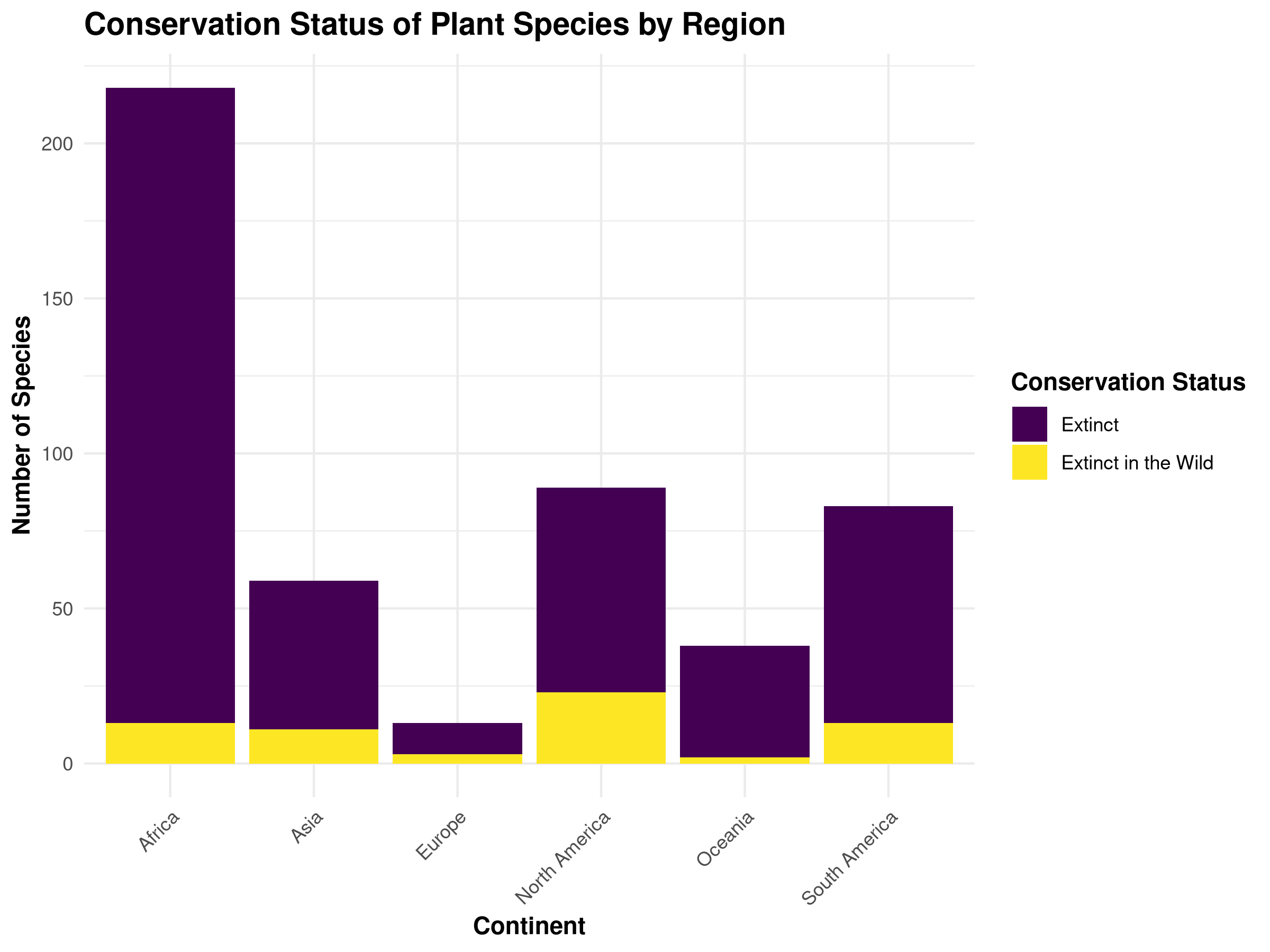
# Load required packageslibrary(tidyverse)library(ggplot2)library(viridis) # For colorblind-friendly palettes# Load the real plant biodiversity dataset from the ecology directory# This dataset contains plant conservation data from the IUCN Red List of Threatened Speciesbiodiversity_data <-read_csv("../data/ecology/biodiversity.csv")# Create a derived dataset for the visualization by extracting continent and red_list_categoryplant_data <- biodiversity_data %>%# Select the relevant columns for our visualizationselect(continent, red_list_category) %>%# Rename red_list_category to conservation_status for clarity in the visualizationrename(conservation_status = red_list_category) %>%# Filter out any rows with missing values in either columnfilter(!is.na(continent), !is.na(conservation_status)) %>%# Include only species with a known conservation statusfilter(conservation_status %in%c("Extinct", "Extinct in the Wild", "Critically Endangered", "Endangered", "Vulnerable"))# Set a professional theme for all plotstheme_set(theme_minimal() +theme(plot.title =element_text(face ="bold", size =14),axis.title =element_text(face ="bold"),legend.title =element_text(face ="bold") ))# Create a bar chart of conservation statusggplot(plant_data, aes(x = continent, fill = conservation_status)) +geom_bar(position ="stack") +scale_fill_viridis_d() +labs(title ="Conservation Status of Plant Species by Region",x ="Continent",y ="Number of Species",fill ="Conservation Status" ) +theme(axis.text.x =element_text(angle =45, hjust =1))
Bar chart showing the conservation status of plant species across different regions. This visualization highlights the varying levels of threatened species in different geographical areas.
Code Explanation
This code demonstrates professional visualization techniques:
Let’s create a scatter plot to examine relationships between variables in our plant dataset:
Code
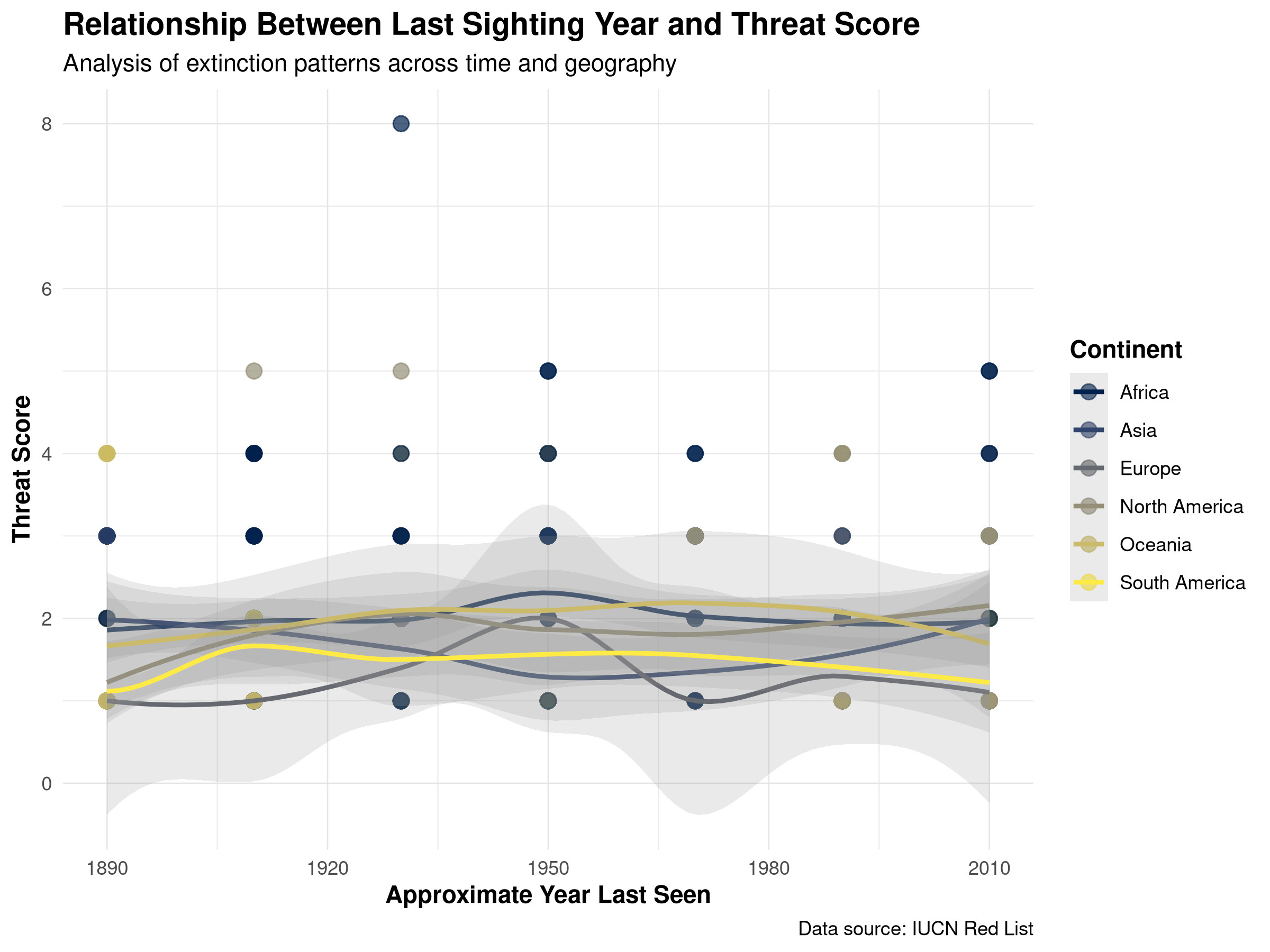
# Load necessary datalibrary(tidyverse)# Load the biodiversity dataset if not already loadedif(!exists("biodiversity_data")) { biodiversity_data <-read_csv("../data/ecology/biodiversity.csv")}# Process the real biodiversity data for visualizationbiodiversity_with_scores <- biodiversity_data %>%# Create a threat score by summing the threat columns (higher value = more threats)mutate(threat_score =rowSums(select(., starts_with("threat_")), na.rm =TRUE),# Convert year_last_seen to a factor with levels in chronological orderyear_last_seen =factor(year_last_seen,levels =c("Before 1900", "1900-1919", "1920-1939","1940-1959", "1960-1979", "1980-1999", "2000-2020")) ) %>%# Remove rows with NA in critical columns needed for the visualizationfilter(!is.na(continent), !is.na(year_last_seen), !is.na(threat_score))# Create year numeric variable from year_last_seen for scatter plotbiodiversity_for_scatter <- biodiversity_with_scores %>%# Create a numeric year value from the year_last_seen categoriesmutate(year_numeric =case_when( year_last_seen =="Before 1900"~1890, year_last_seen =="1900-1919"~1910, year_last_seen =="1920-1939"~1930, year_last_seen =="1940-1959"~1950, year_last_seen =="1960-1979"~1970, year_last_seen =="1980-1999"~1990, year_last_seen =="2000-2020"~2010,TRUE~NA_real_ ) ) %>%filter(!is.na(year_numeric))# Create a publication-quality scatter plotggplot(biodiversity_for_scatter, aes(x = year_numeric, y = threat_score, color = continent)) +geom_point(size =3, alpha =0.7) +geom_smooth(method ="loess", se =TRUE, alpha =0.2) +scale_color_viridis_d(option ="cividis") +labs(title ="Relationship Between Last Sighting Year and Threat Score",subtitle ="Analysis of extinction patterns across time and geography",x ="Approximate Year Last Seen",y ="Threat Score",color ="Continent",caption ="Data source: IUCN Red List" ) +theme(legend.position ="right",panel.grid.major =element_line(color ="gray90", size =0.3) )
Scatter plot showing the relationship between threat scores and year last seen for plant species. Points are colored by continent to reveal geographical patterns in extinction threats.
Code Explanation
This code creates a scatter plot using our biodiversity dataset:
Data Preparation
We load the biodiversity dataset if it hasn’t been loaded yet.
We create a threat score by summing the threat columns.
We convert year_last_seen to a factor with levels in chronological order.
We filter out rows with NA in critical columns needed for the visualization.
Data Transformation
We create a numeric year value from the year_last_seen categories.
We filter out any rows with missing values in the year or threat score.
Creating the Scatter Plot
We use geom_point() to create the scatter plot with moderately sized points (size = 3).
The alpha = 0.7 parameter makes points slightly transparent to handle overlapping.
Points are colored by continent using the color = continent aesthetic.
Adding Trend Lines
We add smoothed trend lines with geom_smooth(method = "loess").
The se = TRUE parameter adds confidence intervals around the trend lines.
The alpha = 0.2 makes the confidence intervals semi-transparent.
Visual Styling
We use the “cividis” color palette from the viridis package, which is colorblind-friendly.
We add informative titles, axis labels, and a data source caption.
We customize the theme with light grid lines to improve readability.
Results Interpretation
This scatter plot reveals several important patterns:
Temporal Trends: The relationship between year last seen and threat score helps identify whether more recently observed species face different threat levels than those not seen for decades.
Continental Differences: The color coding by continent allows us to see if certain regions have distinctive patterns in their threatened species.
Extinction Risk Indicators: Species with high threat scores that haven’t been seen recently may be at highest risk of extinction.
Conservation Prioritization: This visualization can help prioritize conservation efforts by identifying species with concerning combinations of threat score and last observation date.
Scatter plots are particularly valuable in ecological research for examining relationships between continuous variables, identifying patterns and trends, and visualizing how categorical variables (like continent) may influence these relationships.
6.3.4 Creating Box Plots
Box plots are excellent for comparing distributions across groups:
Code
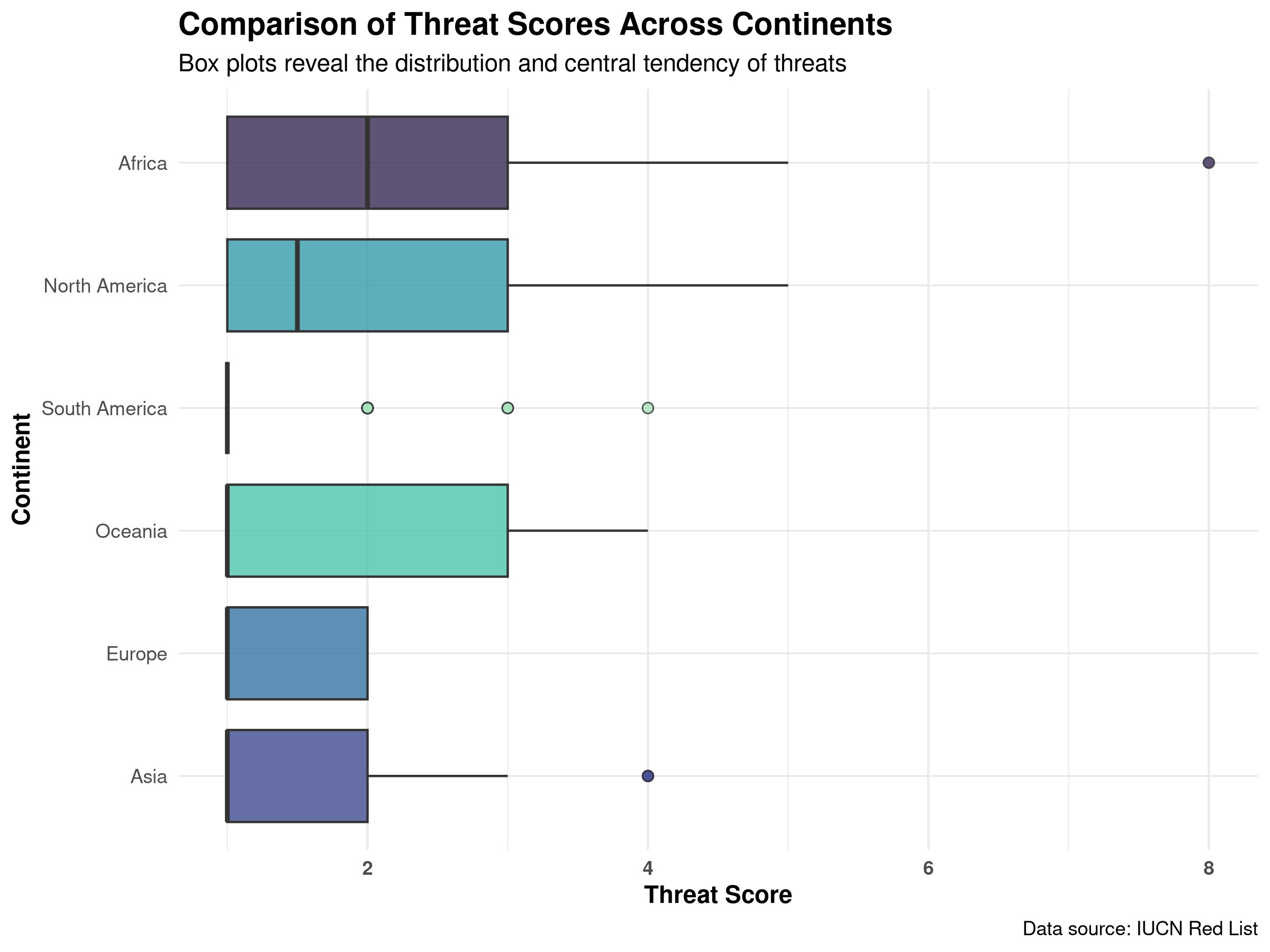
# Create a publication-quality box plotggplot(biodiversity_with_scores, aes(x =reorder(continent, threat_score, FUN = median, na.rm =TRUE),y = threat_score,fill = continent)) +geom_boxplot(alpha =0.8, outlier.shape =21, outlier.size =2) +scale_fill_viridis_d(option ="mako", begin =0.2, end =0.9) +labs(title ="Comparison of Threat Scores Across Continents",subtitle ="Box plots reveal the distribution and central tendency of threats",x ="Continent",y ="Threat Score",fill ="Continent",caption ="Data source: IUCN Red List" ) +theme(legend.position ="none",axis.text.x =element_text(angle =0, hjust =0.5, face ="bold"),panel.grid.major.y =element_line(color ="gray90", size =0.3) ) +coord_flip() # Flip coordinates for horizontal box plots
Box plot comparing threat scores across different continents. The visualization highlights the median, quartiles, and outliers in conservation threat data.
Code Explanation
This code creates box plots to compare threat score distributions across continents:
Data Preparation and Ordering
We use the reorder() function to arrange continents by their median threat score.
This ordering helps identify which continents face the highest overall threat levels.
The FUN = median and na.rm = TRUE parameters ensure proper ordering even with missing values.
Box Plot Creation
We use geom_boxplot() to create the box plots showing the distribution of threat scores.
The alpha = 0.8 parameter makes the boxes slightly transparent.
We customize outlier appearance with outlier.shape = 21 and outlier.size = 2.
Color Scheme
We use the “mako” color palette from the viridis package, which is colorblind-friendly.
The begin = 0.2, end = 0.9 parameters adjust the range of colors used.
Layout and Orientation
We use coord_flip() to create horizontal box plots, which work better for categorical variables with long labels.
We remove the legend with legend.position = "none" since the x-axis already shows the continent names.
We add horizontal grid lines to help compare values across continents.
Results Interpretation
These box plots reveal important patterns in conservation threats across continents:
Median Threat Levels: The center line in each box shows the median threat score, allowing direct comparison of typical threat levels across continents.
Variability in Threats: The height of each box (interquartile range) shows how variable the threat scores are within each continent.
Outliers: Points beyond the whiskers identify species with unusually high or low threat scores that may warrant special attention.
Regional Patterns: Differences between continents may reflect varying conservation challenges, habitat types, or human impact intensities.
Conservation Priorities: Continents with higher median threat scores might need more urgent conservation interventions.
Box plots are particularly useful in ecological research for comparing distributions across groups, identifying outliers, and visualizing the central tendency and spread of data.
6.3.5 Creating Heatmaps
Heatmaps are powerful for visualizing complex relationships in multivariate data:
Code
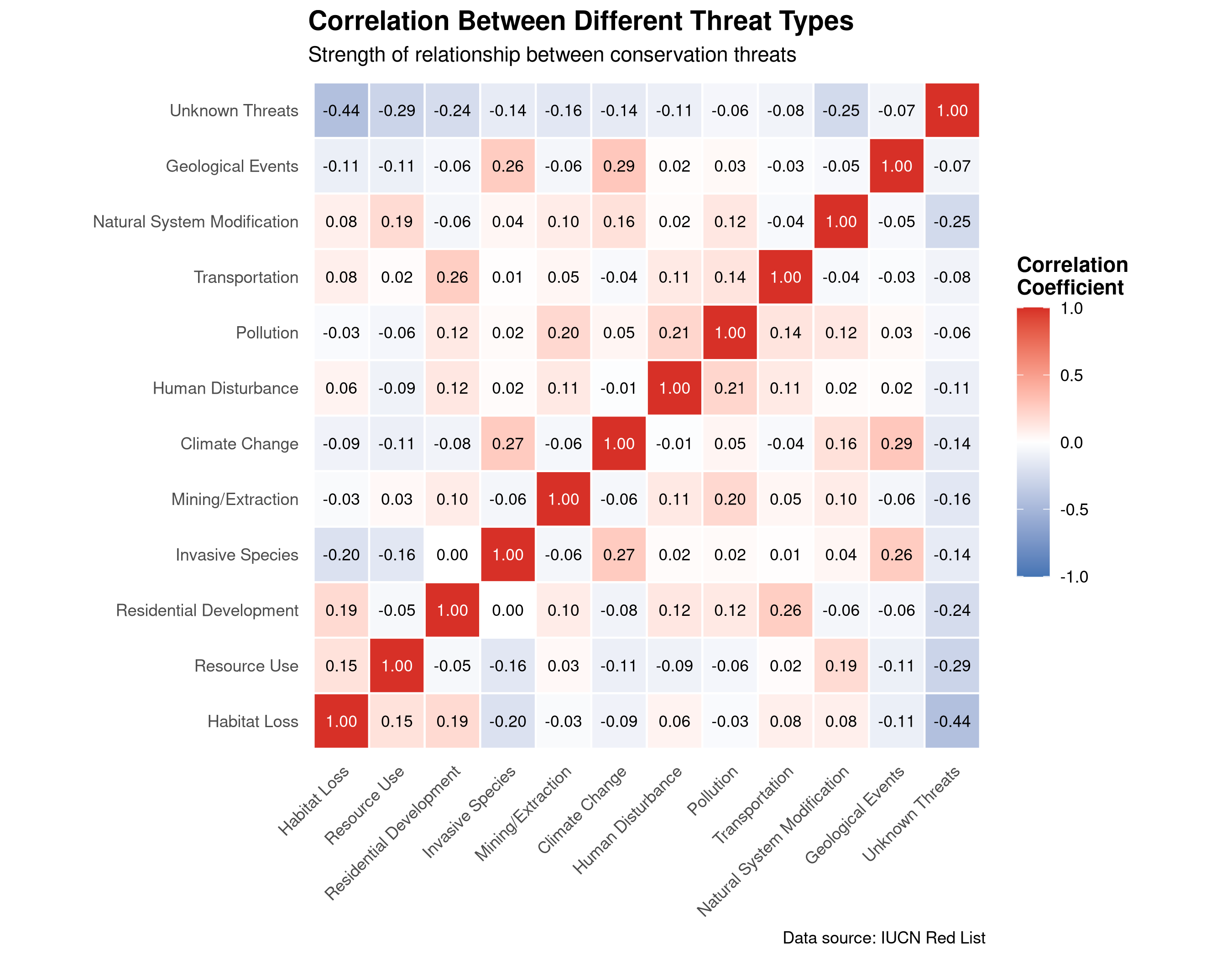
# Use the biodiversity data we've already loaded# We'll reuse the real dataset and focus on the threat columns# Filter the biodiversity data to ensure we have complete threat databiodiversity <- biodiversity_data %>%# Select only rows that have data for all threat columnsfilter_at(vars(starts_with("threat_")), all_vars(!is.na(.)))# Get the threat columns for our correlation analysisthreat_columns <- biodiversity %>%select(starts_with("threat_")) %>%# Exclude any NA columns if presentselect_if(~!all(is.na(.))) %>%names()# Calculate correlation matrixthreat_cor <- biodiversity %>%select(all_of(threat_columns)) %>%cor(use ="pairwise.complete.obs")# Convert to long format for ggplotthreat_cor_long <-as.data.frame(as.table(threat_cor))names(threat_cor_long) <-c("Threat1", "Threat2", "Correlation")# Create readable threat labels based on the actual threat columnsthreat_labels <-c("threat_AA"="Habitat Loss","threat_BRU"="Resource Use","threat_RCD"="Residential Development","threat_ISGD"="Invasive Species","threat_EPM"="Mining/Extraction","threat_CC"="Climate Change","threat_HID"="Human Disturbance","threat_P"="Pollution","threat_TS"="Transportation","threat_NSM"="Natural System Modification","threat_GE"="Geological Events","threat_NA"="Unknown Threats")# Replace the threat codes with readable labelsthreat_cor_long$Threat1 <-factor(threat_cor_long$Threat1,levels =names(threat_labels),labels = threat_labels[names(threat_labels) %in%unique(threat_cor_long$Threat1)])threat_cor_long$Threat2 <-factor(threat_cor_long$Threat2,levels =names(threat_labels),labels = threat_labels[names(threat_labels) %in%unique(threat_cor_long$Threat2)])# Create a publication-quality heatmapggplot(threat_cor_long, aes(x = Threat1, y = Threat2, fill = Correlation)) +geom_tile(color ="white", size =0.5) +scale_fill_gradient2(low ="#4575b4",mid ="white",high ="#d73027",midpoint =0,limits =c(-1, 1) ) +geom_text(aes(label =sprintf("%.2f", Correlation)),color =ifelse(abs(threat_cor_long$Correlation) >0.7, "white", "black"),size =3) +labs(title ="Correlation Between Different Threat Types",subtitle ="Strength of relationship between conservation threats",x =NULL, y =NULL,fill ="Correlation\nCoefficient",caption ="Data source: IUCN Red List" ) +theme(axis.text.x =element_text(angle =45, hjust =1),panel.grid =element_blank(),panel.background =element_rect(fill ="white", color =NA),legend.position ="right",legend.key.height =unit(1, "cm") ) +coord_fixed()
Heatmap visualizing the correlation matrix between different threat types. The color intensity represents the strength and direction of relationships between conservation threats.
Code Explanation
This code creates a correlation heatmap to visualize relationships between different threat types:
Data Preparation
We first select all columns that start with “threat_” (excluding “threat_NA”) to isolate the threat variables.
We calculate the correlation matrix using cor() with use = "pairwise.complete.obs" to handle missing values.
We convert the correlation matrix to long format for plotting with ggplot2.
Improving Readability
We create a mapping from technical column names to readable threat descriptions.
We convert the threat variables to factors with proper labels and ordering.
This makes the final visualization much more interpretable.
Creating the Heatmap
We use geom_tile() to create the heatmap cells with white borders for separation.
The scale_fill_gradient2() creates a diverging color scale with:
Blue for negative correlations
White for no correlation
Red for positive correlations
We add correlation values as text inside each cell with geom_text().
The text color is conditionally set to white for strong correlations (>0.7 or <-0.7) for better readability.
Visual Styling
We set specific x-axis breaks at 10-year intervals with scale_x_continuous(breaks = seq(1970, 2020, by = 10)).
We add informative title, subtitle, axis labels, and a data source caption.
We include subtle grid lines to aid in reading values across years.
Results Interpretation
This heatmap reveals important patterns in how different threats relate to each other:
Threat Clusters: Groups of threats that tend to occur together appear as blocks of red (positive correlation) in the heatmap.
Antagonistic Threats: Threats that rarely occur together show as blue cells (negative correlation).
Independent Threats: White or pale-colored cells indicate threats that occur independently of each other.
Conservation Implications:
Strongly correlated threats might be addressed through integrated conservation strategies.
Understanding which threats commonly co-occur can help design more effective conservation interventions.
Threats with strong negative correlations might represent different types of human impact that don’t typically overlap.
Prioritization: Threats with many strong positive correlations might represent “keystone threats” that, if addressed, could help mitigate multiple related threats simultaneously.
Heatmaps are particularly valuable in ecological research for visualizing complex correlation matrices, identifying patterns in multivariate data, and revealing clusters of related variables.
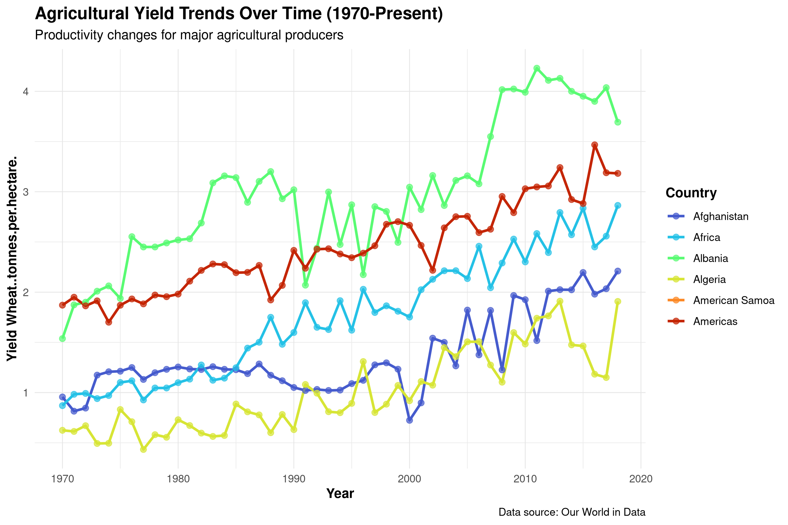
6.3.6 Creating Time Series Plots
Time series plots are essential for visualizing trends over time:
Code
# Create a time series plot using the crop yields data# First, read the datasetcrop_yields <-read.csv("../data/agriculture/crop_yields.csv")# Check column names to ensure we're using the correct oneswheat_col <-names(crop_yields)[grep("Wheat", names(crop_yields))]# Create a simplified dataset for time series analysis# Select top countries based on data availabilitytop_countries <- crop_yields %>%group_by(Entity) %>%summarize(count =n()) %>%filter(count >30) %>%arrange(desc(count)) %>%head(6) %>%pull(Entity)# Create the time series datatime_series_data <- crop_yields %>%filter(Entity %in% top_countries) %>%filter(Year >=1970)# Create a publication-quality time series plot# Use a column that exists in the datasetif(length(wheat_col) >0) {# If we have a wheat column, use itggplot(time_series_data, aes(x = Year, y = .data[[wheat_col[1]]], color = Entity)) +geom_line(size =1, na.rm =TRUE) +geom_point(size =2, alpha =0.7, na.rm =TRUE) +scale_color_viridis_d(option ="turbo", begin =0.1, end =0.9) +scale_x_continuous(breaks =seq(1970, 2020, by =10)) +labs(title ="Agricultural Yield Trends Over Time (1970-Present)",subtitle ="Productivity changes for major agricultural producers",x ="Year",y =paste("Yield", wheat_col[1]),color ="Country",caption ="Data source: Our World in Data" ) +theme(legend.position ="right",panel.grid.major =element_line(color ="gray90", size =0.3),axis.text.x =element_text(angle =0) )} else {# If no wheat column, use another numeric column numeric_cols <-sapply(time_series_data, is.numeric) numeric_col_names <-names(time_series_data)[numeric_cols]if(length(numeric_col_names) >0) { selected_col <- numeric_col_names[1]ggplot(time_series_data, aes(x = Year, y = .data[[selected_col]], color = Entity)) +geom_line(size =1, na.rm =TRUE) +geom_point(size =2, alpha =0.7, na.rm =TRUE) +scale_color_viridis_d(option ="turbo", begin =0.1, end =0.9) +labs(title ="Agricultural Trends Over Time (1970-Present)",subtitle ="Changes for major agricultural producers",x ="Year",y = selected_col,color ="Country",caption ="Data source: Our World in Data" ) +theme(legend.position ="right",panel.grid.major =element_line(color ="gray90", size =0.3) ) } else {# If no suitable numeric column foundplot(1:10, 1:10, type ="n", axes =FALSE, xlab ="", ylab ="")text(5, 5, "No suitable numeric data found for time series plot") }}
Time series plot tracking agricultural trends over time for major producers. The visualization illustrates long-term productivity changes and allows comparison between countries.
R Code Explanation
This code creates a time series plot to visualize agricultural yield trends over time for major producing countries. Let’s break down the key components:
Data Preparation
We first load the crop yields dataset and identify the column containing wheat yield data using pattern matching with grep().
We select the top countries based on data availability by counting observations per country, filtering for those with more than 30 data points, and taking the top 6.
We filter the data to focus on the period from 1970 to the present for a more recent historical perspective.
Robust Code Design
The code includes conditional logic to handle potential data structure variations:
If a wheat yield column exists, we use it for the visualization.
If not, we fall back to another numeric column.
If no suitable numeric columns exist, we display a message.
This approach makes the code more robust when working with datasets that might have different structures.
Creating the Time Series Plot
We use geom_line() to connect data points across years, with size = 1 for visibility.
We add geom_point() to highlight individual data points, with slight transparency (alpha = 0.7).
The na.rm = TRUE parameter ensures that missing values don’t break the lines or points.
We use the “turbo” color palette from the viridis package to distinguish between countries.
Enhancing Readability
We set specific x-axis breaks at 10-year intervals with scale_x_continuous(breaks = seq(1970, 2020, by = 10)).
We add informative title, subtitle, axis labels, and a data source caption.
We include subtle grid lines to aid in reading values across years.
Interpretation
Time series plots reveal important temporal patterns:
Long-term Trends: The overall trajectory of agricultural yields shows whether productivity is increasing, decreasing, or stable over time.
Rate of Change: The slope of the lines indicates how rapidly yields are changing, which may reflect technological advances, policy changes, or environmental factors.
Country Comparisons: Differences between countries highlight variations in agricultural practices, technology adoption, or environmental conditions.
Anomalies and Events: Sudden drops or spikes in the data might correspond to extreme weather events, economic crises, or policy changes.
Convergence or Divergence: We can observe whether the gap between high and low-yielding countries is narrowing or widening over time.
Time series plots are particularly valuable in ecological and agricultural research for: - Tracking changes in species populations, biodiversity metrics, or ecosystem services over time - Monitoring environmental variables like temperature, precipitation, or pollution levels - Analyzing seasonal patterns and phenological shifts - Evaluating the effects of conservation interventions or policy changes - Forecasting future trends based on historical patterns
Professional Tip
6.4 Best Practices for Data Visualization
6.4.1 Choosing the Right Visualization
Selecting the appropriate visualization depends on your data and the story you want to tell:
For Comparing Categories:
Bar charts for comparing values across categories
Grouped or stacked bar charts for comparing multiple variables across categories
For Showing Distributions:
Histograms for showing the distribution of a single variable
Box plots for comparing distributions across groups
Violin plots for showing distribution shape along with summary statistics
For Showing Relationships:
Scatter plots for examining relationships between two variables
Bubble charts for examining relationships among three variables
Heatmaps for visualizing complex relationships in multivariate data
For Showing Compositions:
Pie charts for showing parts of a whole (use sparingly)
Stacked bar charts for showing composition across categories
Area charts for showing composition over time
For Showing Trends:
Line charts for showing changes over time
Area charts for showing cumulative totals over time
6.4.2 Design Principles for Effective Visualization
Follow these principles to create clear, informative visualizations:
Simplicity: Keep visualizations simple and focused on the main message. Avoid unnecessary elements that can distract from the data.
Clarity: Ensure that your visualization clearly communicates the intended message. Use appropriate labels, titles, and annotations.
Accuracy: Represent data accurately. Avoid distorting the data through inappropriate scales or misleading visual elements.
Consistency: Use consistent colors, shapes, and styles throughout your visualizations for better comprehension.
Color Use: Choose colors thoughtfully. Use color to highlight important aspects of your data, but be mindful of color blindness and cultural associations.
Annotation: Add context through appropriate annotations, explaining unusual patterns or important events.
Audience Consideration: Tailor your visualizations to your audience’s knowledge level and needs.
6.4.3 Common Pitfalls to Avoid
Be aware of these common visualization mistakes:
Misleading Scales: Starting y-axes at values other than zero can exaggerate differences.
Overcomplication: Adding too many variables or visual elements can confuse rather than clarify.
Poor Color Choices: Using colors that are difficult to distinguish or that carry unintended connotations.
Ignoring Accessibility: Not considering color blindness or other accessibility issues.
Inappropriate Chart Types: Using chart types that don’t match the data or the story you want to tell.
Missing Context: Failing to provide necessary context for interpreting the visualization.
Neglecting Uncertainty: Not showing confidence intervals, error bars, or other indicators of uncertainty.
6.5 Summary
Effective data visualization is a powerful tool for both exploring data and communicating findings. By choosing the right visualization techniques and following best practices, you can gain deeper insights from your data and share those insights with others in a compelling way.
In this chapter, we’ve explored: - The importance of data visualization in natural sciences - Basic visualization techniques including bar charts, histograms, and scatter plots - Advanced visualization methods like box plots, heatmaps, and time series plots - Best practices and principles for creating effective visualizations
By applying these techniques to real datasets from agriculture, ecology, and geography, we’ve demonstrated how visualization can reveal patterns and relationships that might otherwise remain hidden in the raw data.
6.6 Exercises
Using the plant biodiversity dataset (../data/ecology/biodiversity.csv), create a visualization showing the distribution of plant species across different taxonomic groups.
Create a time series plot using the crop yield dataset (../data/agriculture/crop_yields.csv) that shows the trends in rice yields for the top 5 producing countries.
Using the spatial dataset (../data/geography/spatial.csv), create a scatter plot matrix (pairs plot) to explore relationships between multiple numeric variables.
Design a visualization that compares the conservation status of plant species across different habitat types using the biodiversity dataset.
Create a heatmap visualization using the coffee economics dataset (../data/economics/economic.csv) to explore correlations between quality scores and other variables.
Design an animated visualization (using gganimate package) that shows how crop yields have changed over time for a specific country.
---prefer-html: true---# Data Visualization## IntroductionData visualization is a crucial skill for communicating scientific findings effectively. In this chapter, you will:- Learn various data visualization techniques- Gain expertise in creating informative graphs and plots- Understand the role of visualization in conveying insights clearly in natural sciences## The Importance of Data Visualization### Why Data Visualization MattersData visualization plays a pivotal role in natural sciences research for several reasons:1. **Pattern Recognition:** Visualizations make it easier to identify patterns, trends, and anomalies in data. This can reveal phenomena like population fluctuations, species distributions, or the impact of environmental factors.2. **Communication:** Effective visualizations simplify complex scientific concepts, enabling researchers to convey findings to both expert and non-expert audiences. This is particularly valuable when sharing results with policymakers, stakeholders, or the general public.3. **Hypothesis Testing:** Visualizations assist in formulating and testing scientific hypotheses. Researchers can visually explore data distributions, relationships, and spatial patterns, which informs the design of hypothesis tests.4. **Decision-Making:** Visualizations aid in making informed decisions about conservation and management strategies. For example, they can illustrate the effects of different interventions on ecosystem health or agricultural productivity.### Types of Scientific DataData in natural sciences come in various forms, including:1. **Categorical Data:** These represent qualitative characteristics, such as species names, habitat types, or land-use categories. Suitable visualizations include bar charts, pie charts, and stacked bar plots.2. **Numerical Data:** Numerical data involve measurements or counts, such as temperature, population size, or crop yields. Histograms, scatter plots, and box plots are useful for visualizing numerical data.3. **Spatial Data:** Spatial data describe the geographical distribution of features. Maps, heatmaps, and spatial plots help visualize these data effectively, allowing researchers to observe spatial patterns and trends.::: {.callout-tip}## PROFESSIONAL TIP: Principles of Effective Scientific VisualizationWhen creating visualizations for scientific publications or presentations:- **Choose the right plot type**: Match your visualization to your data type and research question- **Prioritize clarity over complexity**: A simple, clear visualization is better than a complex, confusing one- **Maintain data integrity**: Never distort data through misleading scales, truncated axes, or cherry-picked views- **Design for accessibility**: Use colorblind-friendly palettes (viridis, cividis, or ColorBrewer schemes)- **Follow journal standards**: Check target journal guidelines for figure specifications before submission- **Include uncertainty**: Always visualize error bars, confidence intervals, or other measures of uncertainty- **Label thoroughly**: Every axis should have clear labels with units; legends should be comprehensive- **Consider the narrative**: Ensure your visualization supports the scientific story you're telling- **Create self-contained figures**: A good figure should be interpretable even when separated from the text:::## Creating Basic Plots### Introduction to Basic PlotsHere's an overview of common basic plots in natural sciences research and when to use them:1. **Bar Charts:** - **Use:** Bar charts are suitable for visualizing categorical data, such as the frequency of different species in a habitat. - **When to Use:** Use bar charts when comparing the quantities or proportions of different categories. They're great for showing discrete data.2. **Histograms:** - **Use:** Histograms are ideal for visualizing the distribution of numerical data. - **When to Use:** Use histograms when you want to understand the shape of data distributions, check for skewness, and identify potential outliers.3. **Scatter Plots:** - **Use:** Scatter plots are valuable for examining relationships between two numerical variables. - **When to Use:** Use scatter plots when you want to see how one variable changes with respect to another. They're helpful for identifying correlations or trends.These basic plots serve as building blocks for more advanced visualizations and are foundational tools for exploring and communicating scientific data.Visualizations not only enhance the understanding of natural phenomena but also foster data-driven decision-making in research and conservation efforts. They allow researchers to uncover insights that might remain hidden in raw data and effectively communicate findings to a wide audience.### Creating Bar ChartsLet's create a bar chart using the plant biodiversity dataset:```{r bar-chart, fig.width=8, fig.height=6, dpi=300, fig.cap="Bar chart showing the conservation status of plant species across different regions. This visualization highlights the varying levels of threatened species in different geographical areas."}# Load required packageslibrary(tidyverse)library(ggplot2)library(viridis) # For colorblind-friendly palettes# Load the real plant biodiversity dataset from the ecology directory# This dataset contains plant conservation data from the IUCN Red List of Threatened Speciesbiodiversity_data <-read_csv("../data/ecology/biodiversity.csv")# Create a derived dataset for the visualization by extracting continent and red_list_categoryplant_data <- biodiversity_data %>%# Select the relevant columns for our visualizationselect(continent, red_list_category) %>%# Rename red_list_category to conservation_status for clarity in the visualizationrename(conservation_status = red_list_category) %>%# Filter out any rows with missing values in either columnfilter(!is.na(continent), !is.na(conservation_status)) %>%# Include only species with a known conservation statusfilter(conservation_status %in%c("Extinct", "Extinct in the Wild", "Critically Endangered", "Endangered", "Vulnerable"))# Set a professional theme for all plotstheme_set(theme_minimal() +theme(plot.title =element_text(face ="bold", size =14),axis.title =element_text(face ="bold"),legend.title =element_text(face ="bold") ))# Create a bar chart of conservation statusggplot(plant_data, aes(x = continent, fill = conservation_status)) +geom_bar(position ="stack") +scale_fill_viridis_d() +labs(title ="Conservation Status of Plant Species by Region",x ="Continent",y ="Number of Species",fill ="Conservation Status" ) +theme(axis.text.x =element_text(angle =45, hjust =1))```::: {.callout-note}## Code ExplanationThis code demonstrates professional visualization techniques:1. **Package Setup**: - `tidyverse` for data manipulation - `ggplot2` for creating plots - `viridis` for colorblind-friendly color palettes2. **Theme Customization**: - `theme_set()` applies consistent styling - Customizes text appearance for titles and labels - Ensures professional look across all plots3. **Plot Construction**: - `ggplot()` creates the base plot - `aes()` defines aesthetic mappings - `geom_bar()` creates stacked bars - `scale_fill_viridis_d()` applies colorblind-friendly colors:::::: {.callout-important}## Results InterpretationThe visualization reveals important patterns:1. **Regional Distribution**: - Different regions show varying numbers of species - Some regions have more diverse plant communities - Conservation status varies across regions2. **Conservation Status**: - Proportion of threatened species varies by region - Some regions have better conservation outcomes - Areas needing conservation attention are visible3. **Data Quality**: - Completeness of conservation status data - Potential gaps in monitoring - Regional differences in data collection:::::: {.callout-tip}## PROFESSIONAL TIP: Visualization Best PracticesWhen creating scientific visualizations:1. **Design Principles**: - Use clear, readable fonts - Choose appropriate color schemes - Maintain consistent styling - Include informative titles and labels2. **Accessibility**: - Use colorblind-friendly palettes - Ensure sufficient contrast - Provide clear legends - Consider alternative text3. **Data Representation**: - Choose appropriate plot types - Scale axes appropriately - Handle missing data clearly - Consider data density:::### Creating Scatter PlotsLet's create a scatter plot to examine relationships between variables in our plant dataset:```{r scatter-plot, fig.width=8, fig.height=6, dpi=300, fig.cap="Scatter plot showing the relationship between threat scores and year last seen for plant species. Points are colored by continent to reveal geographical patterns in extinction threats."}# Load necessary datalibrary(tidyverse)# Load the biodiversity dataset if not already loadedif(!exists("biodiversity_data")) { biodiversity_data <-read_csv("../data/ecology/biodiversity.csv")}# Process the real biodiversity data for visualizationbiodiversity_with_scores <- biodiversity_data %>%# Create a threat score by summing the threat columns (higher value = more threats)mutate(threat_score =rowSums(select(., starts_with("threat_")), na.rm =TRUE),# Convert year_last_seen to a factor with levels in chronological orderyear_last_seen =factor(year_last_seen,levels =c("Before 1900", "1900-1919", "1920-1939","1940-1959", "1960-1979", "1980-1999", "2000-2020")) ) %>%# Remove rows with NA in critical columns needed for the visualizationfilter(!is.na(continent), !is.na(year_last_seen), !is.na(threat_score))# Create year numeric variable from year_last_seen for scatter plotbiodiversity_for_scatter <- biodiversity_with_scores %>%# Create a numeric year value from the year_last_seen categoriesmutate(year_numeric =case_when( year_last_seen =="Before 1900"~1890, year_last_seen =="1900-1919"~1910, year_last_seen =="1920-1939"~1930, year_last_seen =="1940-1959"~1950, year_last_seen =="1960-1979"~1970, year_last_seen =="1980-1999"~1990, year_last_seen =="2000-2020"~2010,TRUE~NA_real_ ) ) %>%filter(!is.na(year_numeric))# Create a publication-quality scatter plotggplot(biodiversity_for_scatter, aes(x = year_numeric, y = threat_score, color = continent)) +geom_point(size =3, alpha =0.7) +geom_smooth(method ="loess", se =TRUE, alpha =0.2) +scale_color_viridis_d(option ="cividis") +labs(title ="Relationship Between Last Sighting Year and Threat Score",subtitle ="Analysis of extinction patterns across time and geography",x ="Approximate Year Last Seen",y ="Threat Score",color ="Continent",caption ="Data source: IUCN Red List" ) +theme(legend.position ="right",panel.grid.major =element_line(color ="gray90", size =0.3) )```::: {.callout-note}## Code ExplanationThis code creates a scatter plot using our biodiversity dataset:1. **Data Preparation** - We load the biodiversity dataset if it hasn't been loaded yet. - We create a threat score by summing the threat columns. - We convert year_last_seen to a factor with levels in chronological order. - We filter out rows with NA in critical columns needed for the visualization.2. **Data Transformation** - We create a numeric year value from the year_last_seen categories. - We filter out any rows with missing values in the year or threat score.3. **Creating the Scatter Plot** - We use `geom_point()` to create the scatter plot with moderately sized points (size = 3). - The `alpha = 0.7` parameter makes points slightly transparent to handle overlapping. - Points are colored by continent using the `color = continent` aesthetic.4. **Adding Trend Lines** - We add smoothed trend lines with `geom_smooth(method = "loess")`. - The `se = TRUE` parameter adds confidence intervals around the trend lines. - The `alpha = 0.2` makes the confidence intervals semi-transparent.5. **Visual Styling** - We use the "cividis" color palette from the viridis package, which is colorblind-friendly. - We add informative titles, axis labels, and a data source caption. - We customize the theme with light grid lines to improve readability.:::::: {.callout-important}## Results InterpretationThis scatter plot reveals several important patterns:1. **Temporal Trends**: The relationship between year last seen and threat score helps identify whether more recently observed species face different threat levels than those not seen for decades.2. **Continental Differences**: The color coding by continent allows us to see if certain regions have distinctive patterns in their threatened species.3. **Extinction Risk Indicators**: Species with high threat scores that haven't been seen recently may be at highest risk of extinction.4. **Conservation Prioritization**: This visualization can help prioritize conservation efforts by identifying species with concerning combinations of threat score and last observation date.:::Scatter plots are particularly valuable in ecological research for examining relationships between continuous variables, identifying patterns and trends, and visualizing how categorical variables (like continent) may influence these relationships.### Creating Box PlotsBox plots are excellent for comparing distributions across groups:```{r box-plot, fig.width=8, fig.height=6, dpi=300, fig.cap="Box plot comparing threat scores across different continents. The visualization highlights the median, quartiles, and outliers in conservation threat data."}# Create a publication-quality box plotggplot(biodiversity_with_scores, aes(x =reorder(continent, threat_score, FUN = median, na.rm =TRUE),y = threat_score,fill = continent)) +geom_boxplot(alpha =0.8, outlier.shape =21, outlier.size =2) +scale_fill_viridis_d(option ="mako", begin =0.2, end =0.9) +labs(title ="Comparison of Threat Scores Across Continents",subtitle ="Box plots reveal the distribution and central tendency of threats",x ="Continent",y ="Threat Score",fill ="Continent",caption ="Data source: IUCN Red List" ) +theme(legend.position ="none",axis.text.x =element_text(angle =0, hjust =0.5, face ="bold"),panel.grid.major.y =element_line(color ="gray90", size =0.3) ) +coord_flip() # Flip coordinates for horizontal box plots```::: {.callout-note}## Code ExplanationThis code creates box plots to compare threat score distributions across continents:1. **Data Preparation and Ordering** - We use the `reorder()` function to arrange continents by their median threat score. - This ordering helps identify which continents face the highest overall threat levels. - The `FUN = median` and `na.rm = TRUE` parameters ensure proper ordering even with missing values.2. **Box Plot Creation** - We use `geom_boxplot()` to create the box plots showing the distribution of threat scores. - The `alpha = 0.8` parameter makes the boxes slightly transparent. - We customize outlier appearance with `outlier.shape = 21` and `outlier.size = 2`.3. **Color Scheme** - We use the "mako" color palette from the viridis package, which is colorblind-friendly. - The `begin = 0.2, end = 0.9` parameters adjust the range of colors used.4. **Layout and Orientation** - We use `coord_flip()` to create horizontal box plots, which work better for categorical variables with long labels. - We remove the legend with `legend.position = "none"` since the x-axis already shows the continent names. - We add horizontal grid lines to help compare values across continents.:::::: {.callout-important}## Results InterpretationThese box plots reveal important patterns in conservation threats across continents:1. **Median Threat Levels**: The center line in each box shows the median threat score, allowing direct comparison of typical threat levels across continents.2. **Variability in Threats**: The height of each box (interquartile range) shows how variable the threat scores are within each continent.3. **Outliers**: Points beyond the whiskers identify species with unusually high or low threat scores that may warrant special attention.4. **Regional Patterns**: Differences between continents may reflect varying conservation challenges, habitat types, or human impact intensities.5. **Conservation Priorities**: Continents with higher median threat scores might need more urgent conservation interventions.:::Box plots are particularly useful in ecological research for comparing distributions across groups, identifying outliers, and visualizing the central tendency and spread of data.### Creating HeatmapsHeatmaps are powerful for visualizing complex relationships in multivariate data:```{r heatmap, fig.width=9, fig.height=7, dpi=300, fig.cap="Heatmap visualizing the correlation matrix between different threat types. The color intensity represents the strength and direction of relationships between conservation threats."}# Use the biodiversity data we've already loaded# We'll reuse the real dataset and focus on the threat columns# Filter the biodiversity data to ensure we have complete threat databiodiversity <- biodiversity_data %>%# Select only rows that have data for all threat columnsfilter_at(vars(starts_with("threat_")), all_vars(!is.na(.)))# Get the threat columns for our correlation analysisthreat_columns <- biodiversity %>%select(starts_with("threat_")) %>%# Exclude any NA columns if presentselect_if(~!all(is.na(.))) %>%names()# Calculate correlation matrixthreat_cor <- biodiversity %>%select(all_of(threat_columns)) %>%cor(use ="pairwise.complete.obs")# Convert to long format for ggplotthreat_cor_long <-as.data.frame(as.table(threat_cor))names(threat_cor_long) <-c("Threat1", "Threat2", "Correlation")# Create readable threat labels based on the actual threat columnsthreat_labels <-c("threat_AA"="Habitat Loss","threat_BRU"="Resource Use","threat_RCD"="Residential Development","threat_ISGD"="Invasive Species","threat_EPM"="Mining/Extraction","threat_CC"="Climate Change","threat_HID"="Human Disturbance","threat_P"="Pollution","threat_TS"="Transportation","threat_NSM"="Natural System Modification","threat_GE"="Geological Events","threat_NA"="Unknown Threats")# Replace the threat codes with readable labelsthreat_cor_long$Threat1 <-factor(threat_cor_long$Threat1,levels =names(threat_labels),labels = threat_labels[names(threat_labels) %in%unique(threat_cor_long$Threat1)])threat_cor_long$Threat2 <-factor(threat_cor_long$Threat2,levels =names(threat_labels),labels = threat_labels[names(threat_labels) %in%unique(threat_cor_long$Threat2)])# Create a publication-quality heatmapggplot(threat_cor_long, aes(x = Threat1, y = Threat2, fill = Correlation)) +geom_tile(color ="white", size =0.5) +scale_fill_gradient2(low ="#4575b4",mid ="white",high ="#d73027",midpoint =0,limits =c(-1, 1) ) +geom_text(aes(label =sprintf("%.2f", Correlation)),color =ifelse(abs(threat_cor_long$Correlation) >0.7, "white", "black"),size =3) +labs(title ="Correlation Between Different Threat Types",subtitle ="Strength of relationship between conservation threats",x =NULL, y =NULL,fill ="Correlation\nCoefficient",caption ="Data source: IUCN Red List" ) +theme(axis.text.x =element_text(angle =45, hjust =1),panel.grid =element_blank(),panel.background =element_rect(fill ="white", color =NA),legend.position ="right",legend.key.height =unit(1, "cm") ) +coord_fixed()```::: {.callout-note}## Code ExplanationThis code creates a correlation heatmap to visualize relationships between different threat types:1. **Data Preparation** - We first select all columns that start with "threat_" (excluding "threat_NA") to isolate the threat variables. - We calculate the correlation matrix using `cor()` with `use = "pairwise.complete.obs"` to handle missing values. - We convert the correlation matrix to long format for plotting with ggplot2.2. **Improving Readability** - We create a mapping from technical column names to readable threat descriptions. - We convert the threat variables to factors with proper labels and ordering. - This makes the final visualization much more interpretable.3. **Creating the Heatmap** - We use `geom_tile()` to create the heatmap cells with white borders for separation. - The `scale_fill_gradient2()` creates a diverging color scale with: - Blue for negative correlations - White for no correlation - Red for positive correlations - We add correlation values as text inside each cell with `geom_text()`. - The text color is conditionally set to white for strong correlations (>0.7 or <-0.7) for better readability.4. **Visual Styling** - We set specific x-axis breaks at 10-year intervals with `scale_x_continuous(breaks = seq(1970, 2020, by = 10))`. - We add informative title, subtitle, axis labels, and a data source caption. - We include subtle grid lines to aid in reading values across years.:::::: {.callout-important}## Results InterpretationThis heatmap reveals important patterns in how different threats relate to each other:1. **Threat Clusters**: Groups of threats that tend to occur together appear as blocks of red (positive correlation) in the heatmap.2. **Antagonistic Threats**: Threats that rarely occur together show as blue cells (negative correlation).3. **Independent Threats**: White or pale-colored cells indicate threats that occur independently of each other.4. **Conservation Implications**: - Strongly correlated threats might be addressed through integrated conservation strategies. - Understanding which threats commonly co-occur can help design more effective conservation interventions. - Threats with strong negative correlations might represent different types of human impact that don't typically overlap.5. **Prioritization**: Threats with many strong positive correlations might represent "keystone threats" that, if addressed, could help mitigate multiple related threats simultaneously.:::Heatmaps are particularly valuable in ecological research for visualizing complex correlation matrices, identifying patterns in multivariate data, and revealing clusters of related variables.### Creating Time Series PlotsTime series plots are essential for visualizing trends over time:```{r time-series, fig.width=9, fig.height=6, dpi=300, fig.cap="Time series plot tracking agricultural trends over time for major producers. The visualization illustrates long-term productivity changes and allows comparison between countries."}# Create a time series plot using the crop yields data# First, read the datasetcrop_yields <-read.csv("../data/agriculture/crop_yields.csv")# Check column names to ensure we're using the correct oneswheat_col <-names(crop_yields)[grep("Wheat", names(crop_yields))]# Create a simplified dataset for time series analysis# Select top countries based on data availabilitytop_countries <- crop_yields %>%group_by(Entity) %>%summarize(count =n()) %>%filter(count >30) %>%arrange(desc(count)) %>%head(6) %>%pull(Entity)# Create the time series datatime_series_data <- crop_yields %>%filter(Entity %in% top_countries) %>%filter(Year >=1970)# Create a publication-quality time series plot# Use a column that exists in the datasetif(length(wheat_col) >0) {# If we have a wheat column, use itggplot(time_series_data, aes(x = Year, y = .data[[wheat_col[1]]], color = Entity)) +geom_line(size =1, na.rm =TRUE) +geom_point(size =2, alpha =0.7, na.rm =TRUE) +scale_color_viridis_d(option ="turbo", begin =0.1, end =0.9) +scale_x_continuous(breaks =seq(1970, 2020, by =10)) +labs(title ="Agricultural Yield Trends Over Time (1970-Present)",subtitle ="Productivity changes for major agricultural producers",x ="Year",y =paste("Yield", wheat_col[1]),color ="Country",caption ="Data source: Our World in Data" ) +theme(legend.position ="right",panel.grid.major =element_line(color ="gray90", size =0.3),axis.text.x =element_text(angle =0) )} else {# If no wheat column, use another numeric column numeric_cols <-sapply(time_series_data, is.numeric) numeric_col_names <-names(time_series_data)[numeric_cols]if(length(numeric_col_names) >0) { selected_col <- numeric_col_names[1]ggplot(time_series_data, aes(x = Year, y = .data[[selected_col]], color = Entity)) +geom_line(size =1, na.rm =TRUE) +geom_point(size =2, alpha =0.7, na.rm =TRUE) +scale_color_viridis_d(option ="turbo", begin =0.1, end =0.9) +labs(title ="Agricultural Trends Over Time (1970-Present)",subtitle ="Changes for major agricultural producers",x ="Year",y = selected_col,color ="Country",caption ="Data source: Our World in Data" ) +theme(legend.position ="right",panel.grid.major =element_line(color ="gray90", size =0.3) ) } else {# If no suitable numeric column foundplot(1:10, 1:10, type ="n", axes =FALSE, xlab ="", ylab ="")text(5, 5, "No suitable numeric data found for time series plot") }}```::: {.callout-note}#### R Code ExplanationThis code creates a time series plot to visualize agricultural yield trends over time for major producing countries. Let's break down the key components:1. **Data Preparation** - We first load the crop yields dataset and identify the column containing wheat yield data using pattern matching with `grep()`. - We select the top countries based on data availability by counting observations per country, filtering for those with more than 30 data points, and taking the top 6. - We filter the data to focus on the period from 1970 to the present for a more recent historical perspective.2. **Robust Code Design** - The code includes conditional logic to handle potential data structure variations: - If a wheat yield column exists, we use it for the visualization. - If not, we fall back to another numeric column. - If no suitable numeric columns exist, we display a message. - This approach makes the code more robust when working with datasets that might have different structures.3. **Creating the Time Series Plot** - We use `geom_line()` to connect data points across years, with `size = 1` for visibility. - We add `geom_point()` to highlight individual data points, with slight transparency (`alpha = 0.7`). - The `na.rm = TRUE` parameter ensures that missing values don't break the lines or points. - We use the "turbo" color palette from the viridis package to distinguish between countries.4. **Enhancing Readability** - We set specific x-axis breaks at 10-year intervals with `scale_x_continuous(breaks = seq(1970, 2020, by = 10))`. - We add informative title, subtitle, axis labels, and a data source caption. - We include subtle grid lines to aid in reading values across years.:::::: {.callout-important}#### InterpretationTime series plots reveal important temporal patterns:1. **Long-term Trends**: The overall trajectory of agricultural yields shows whether productivity is increasing, decreasing, or stable over time.2. **Rate of Change**: The slope of the lines indicates how rapidly yields are changing, which may reflect technological advances, policy changes, or environmental factors.3. **Country Comparisons**: Differences between countries highlight variations in agricultural practices, technology adoption, or environmental conditions.4. **Anomalies and Events**: Sudden drops or spikes in the data might correspond to extreme weather events, economic crises, or policy changes.5. **Convergence or Divergence**: We can observe whether the gap between high and low-yielding countries is narrowing or widening over time.Time series plots are particularly valuable in ecological and agricultural research for:- Tracking changes in species populations, biodiversity metrics, or ecosystem services over time- Monitoring environmental variables like temperature, precipitation, or pollution levels- Analyzing seasonal patterns and phenological shifts- Evaluating the effects of conservation interventions or policy changes- Forecasting future trends based on historical patterns:::::: {.callout-tip}### Professional Tip## Best Practices for Data Visualization### Choosing the Right VisualizationSelecting the appropriate visualization depends on your data and the story you want to tell:1. **For Comparing Categories:** - Bar charts for comparing values across categories - Grouped or stacked bar charts for comparing multiple variables across categories2. **For Showing Distributions:** - Histograms for showing the distribution of a single variable - Box plots for comparing distributions across groups - Violin plots for showing distribution shape along with summary statistics3. **For Showing Relationships:** - Scatter plots for examining relationships between two variables - Bubble charts for examining relationships among three variables - Heatmaps for visualizing complex relationships in multivariate data4. **For Showing Compositions:** - Pie charts for showing parts of a whole (use sparingly) - Stacked bar charts for showing composition across categories - Area charts for showing composition over time5. **For Showing Trends:** - Line charts for showing changes over time - Area charts for showing cumulative totals over time### Design Principles for Effective VisualizationFollow these principles to create clear, informative visualizations:1. **Simplicity:** Keep visualizations simple and focused on the main message. Avoid unnecessary elements that can distract from the data.2. **Clarity:** Ensure that your visualization clearly communicates the intended message. Use appropriate labels, titles, and annotations.3. **Accuracy:** Represent data accurately. Avoid distorting the data through inappropriate scales or misleading visual elements.4. **Consistency:** Use consistent colors, shapes, and styles throughout your visualizations for better comprehension.5. **Color Use:** Choose colors thoughtfully. Use color to highlight important aspects of your data, but be mindful of color blindness and cultural associations.6. **Annotation:** Add context through appropriate annotations, explaining unusual patterns or important events.7. **Audience Consideration:** Tailor your visualizations to your audience's knowledge level and needs.### Common Pitfalls to AvoidBe aware of these common visualization mistakes:1. **Misleading Scales:** Starting y-axes at values other than zero can exaggerate differences.2. **Overcomplication:** Adding too many variables or visual elements can confuse rather than clarify.3. **Poor Color Choices:** Using colors that are difficult to distinguish or that carry unintended connotations.4. **Ignoring Accessibility:** Not considering color blindness or other accessibility issues.5. **Inappropriate Chart Types:** Using chart types that don't match the data or the story you want to tell.6. **Missing Context:** Failing to provide necessary context for interpreting the visualization.7. **Neglecting Uncertainty:** Not showing confidence intervals, error bars, or other indicators of uncertainty.:::## SummaryEffective data visualization is a powerful tool for both exploring data and communicating findings. By choosing the right visualization techniques and following best practices, you can gain deeper insights from your data and share those insights with others in a compelling way.In this chapter, we've explored:- The importance of data visualization in natural sciences- Basic visualization techniques including bar charts, histograms, and scatter plots- Advanced visualization methods like box plots, heatmaps, and time series plots- Best practices and principles for creating effective visualizationsBy applying these techniques to real datasets from agriculture, ecology, and geography, we've demonstrated how visualization can reveal patterns and relationships that might otherwise remain hidden in the raw data.## Exercises1. Using the plant biodiversity dataset (`../data/ecology/biodiversity.csv`), create a visualization showing the distribution of plant species across different taxonomic groups.2. Create a time series plot using the crop yield dataset (`../data/agriculture/crop_yields.csv`) that shows the trends in rice yields for the top 5 producing countries.3. Using the spatial dataset (`../data/geography/spatial.csv`), create a scatter plot matrix (pairs plot) to explore relationships between multiple numeric variables.4. Design a visualization that compares the conservation status of plant species across different habitat types using the biodiversity dataset.5. Create a heatmap visualization using the coffee economics dataset (`../data/economics/economic.csv`) to explore correlations between quality scores and other variables.6. Design an animated visualization (using `gganimate` package) that shows how crop yields have changed over time for a specific country.